


In 1976 I took a trip to Los Angeles with Jim Petrillo and Betsy Davids, then Rebis Press, so that we could do a number of performances at a theater in Hollywood, meet book dealers, and other things. That trip formed the basis of this book, but the immediate prompting for its title and form was a visit we paid to a young book dealer interested in making his way and ours in the world. His recommendation was to make work that fit various niches. Alphabet books, travel books, books of private letters, books about the bicentennial year -- these were categories that would guarantee sales to collectors of those genres or specialized topics. Thinking myself clever indeed, I returned to the Bay Area and wrote this travel book of private letters as alphabet book composed in the bicentennial year. So cryptic and coded was the text of this book that I think it would require rather an extreme amount of gloss to even signal to a collector that this book is of ANY genre, let alone all of those. The conceptual foundation of the book was more profound, since it was a work about language and landscape, experience and representation. In its first version (the existing pages are the residual half of original sheets twice their size), the book had etching on the top and text on the bottom. For various reasons, logistical and aesthetic, the etchings were ditched. (Logistical -- I was trying to print at CCAC in the hours before the print shop opened so that I could do this undetected and basically illegally before going to work at the West Coast Print Center and all in all it was just too much to try to do). (Aesthetic -- I don't recall the etchings very well, but they weren't coming out the way I had planned. A later book, done in Amsterdam, took up some of the issues in those etching and made them into a book in The Experience of the Medium). The essential issues motivating the book structure were to deconstruct a narrative into constituent elements by collapsing the temporal continuum onto a single plane of present -- the space of the pages. Each acts as such a screen for the sum total of the narrative elements in its small "chapter" of events. A sense of foreground, middle ground, and other references to the spatialized information of projected images (basic perspective) organizes some of the language. But the language themes in this book also include a narrative, found visual language, overheard language, and metalanguage and puns -- all to tell the "story" of our weird trip.
Originally the sheets were twice their final size. The etching plates were printed in the space above the texts. I think I printed about three states of the etching (a continuous etching, as I recall) and then I junked that idea, tore the sheets to the smaller size, and went ahead printing the texts. The orignal text was longer, more discursive. Bob Grenier commented on it, finding the sheets in a notebook one day at Barrett Watten's and his apartment. "Where did you get those sentences?" he asked me. "Where?" I wish I had that original text, curious as I am now about its structure and the way it relates to the final, very distilled and extracted form of the book. The typographic production wasn't difficult, as there wasn't too much text, though thinking through the designs was work. I believe I damped the sheets, hence the clean impression and the deep incision, as well as the light ink color.
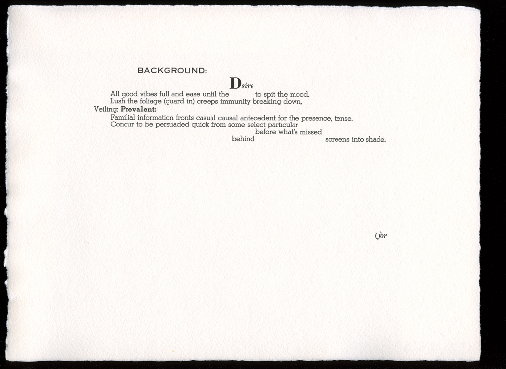
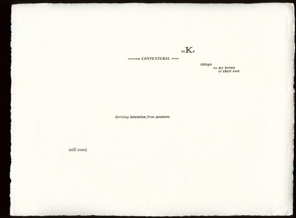
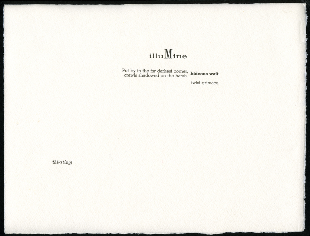
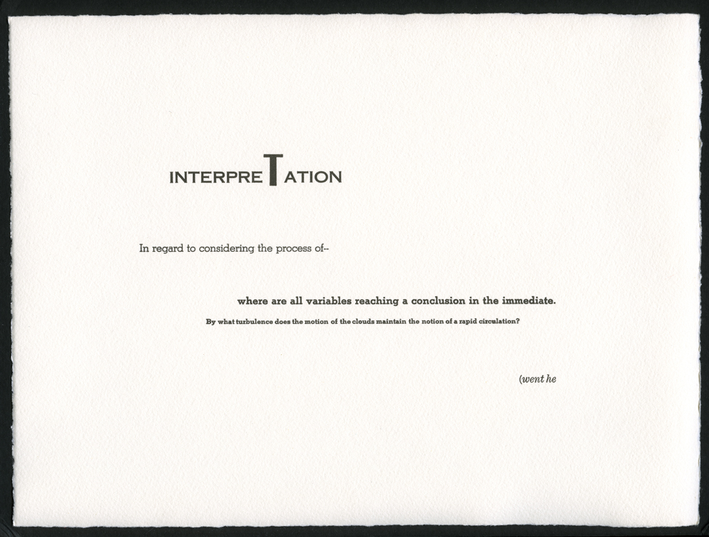
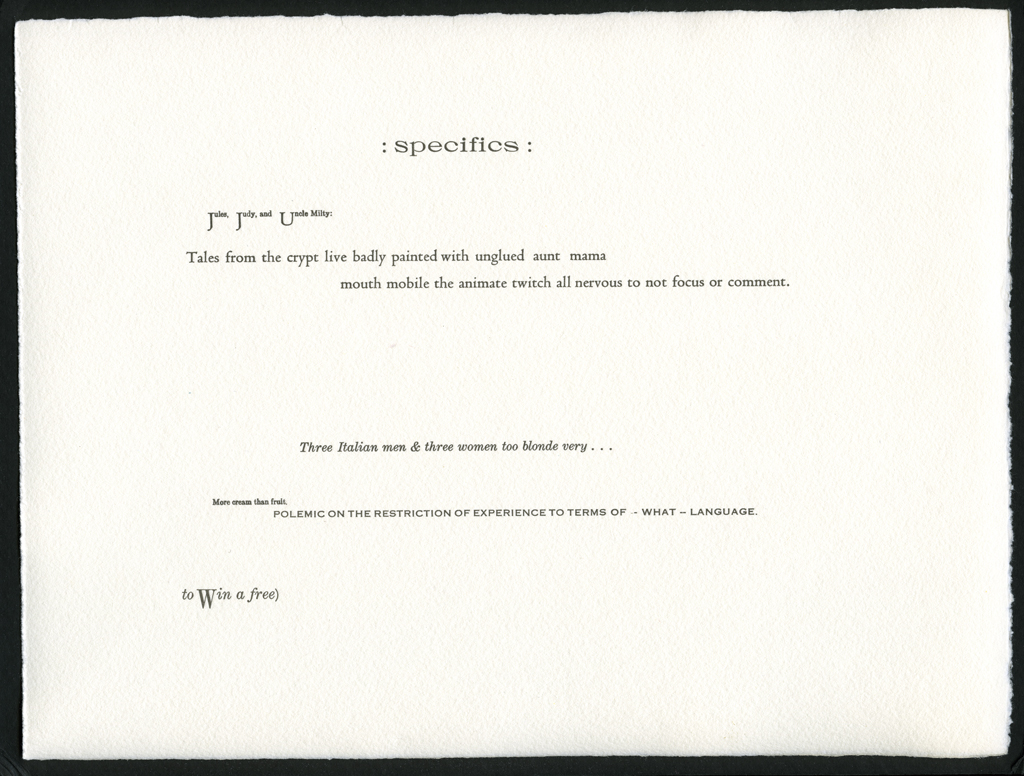
typographic: The type changes shape on every page, but themes are identifiable. The Caslon bold italic was for overheard language. The Century italic was for the punning page numbers, and narrative statements, as was some of the Stymie. More figured or decorative fonts were for found graphic language. The Copperplate was used for a text about landscape and topology. The letters that "spoke" their own names on each sheet were picked according to whim and for their larger size.
graphical: Layout is everything in this book. The shapes of the words, the connections among themes, and the fragmentary but well-balanced compositions are like bones of a once-fleshed narrative.
openings: Each page is meant as a field, but as part of a sequence in space.
development: A curious spatial development actually occurs here, but hard to see unless one knows to look.
sequence: Thematic rhymes occur throughout, signalled by typography and layout.
The idea of these words as the bones of a narrative led to the creation of the performance and the annotation. The deconstructed condition of narrative into langauge constituents is a unique conceptual idea, as is the spatialization of the narrative through the book sequence.
Johanna Drucker
type: initiating
role:
artist
publisher
printer
publisher: Chased Press
date of publication:production: 1976-07-00:1976-12-00
publication: 1976-00-00
publisher: Druckwerk
publication history: Produced entirely by Johanna Drucker from July to December, 1976. [A. Schutte]
subject: artists' books (LCSH)
themes: Los Angeles, language, structure, form, and narrative.
content form: experimental text (local)
publication tradition: artists' book (local)
inspiration: Hard to say, the work is truly idiosyncratic in conception and execution.
related works: Experience of the Medium, and Quantum, are both related. The first because it became the means to realize the sequential etching project I had wanted to include so that the landscape projection and temporal unfolding of events in a single image space could be visualized. The second because it uses space/time to divide the page and organize page sequence. Also, the annotated edition is a related work.
other influences: none, though Alistair Johnston wanted to believe this was a Mallarmean undertaking.
community: press West Coast Print Center and Rebis Press
manuscript type: other
location: artist's archive
note: Doubt much is left. All the mauscript materials I had from this period were jettisoned when I left for Greece in the fall of 1977.
For all its obscurity (and it is practically just remnants and fragments of langauge code, unless read in the glossed, annotated version) this is still a visually interesting work. Every page has that "balance" that mobiles have, and the often spare typography calls attention to the object status of each linguistic phrase or word.
title note: The following subtitles also appear on the title page: Let Her's not a matter of permission 2:J & B [A. Schutte]
edition type: editioned
publisher: Chased Press
place: West Coast Print Center, Oakland/Berkeley, California.
horizontal: 11 inches closed
vertical: 9 inches closed
depth: 1 inches closed
production means:
letterpress (local)
binding: boxed (local)
substrate:
bookBlock: paper
media:
ink (local)
other materials: box, blue linen cloth
format: Boxed sheets.
cover: There is no cover for this work. The pages are held in a blue linen box, cut to the size and shape of the pages.
color: yes The is blue, but the pages are all black and white.
devices: The work is held inside a blue box that is covered in blue linen. The box is cut to the size and shape of the pages. The top opens, bound on the left, to reveal the pages inside.
pagination: unpaginated 29 loose sheets
numbered?: numbered
signed?: signed
On copperplate/in junk type/with scrap lead no lock up bar or tweezers & almost no brasses or coppers/thirty copies attempted at the print center from July to December/& all by my own hands: Johanna Drucker/Chased Press