


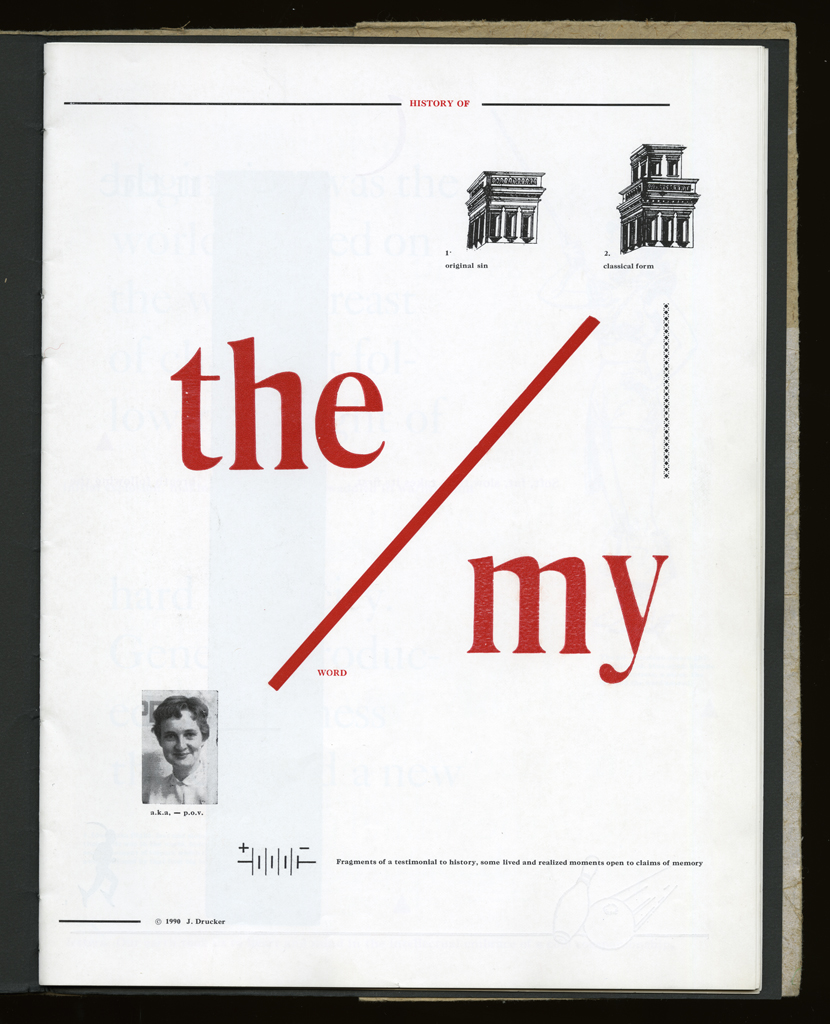


Several themes interweave in this book: a feminist rewriting of the history of the world, an opposition between official history and personal memory, a critique of feminist theoretical attitudes towards language as patriarchal, and all sorts of graphical and textual puns and play. The book is a tribute to my mother, and the drum majorette who opens the book is a figure that corresponds to her early years, youth, and activities as a baton twirling teen in Downer's Grove, Illinois. I had learned language, and literature, through an intense and intimate relation with her. The feminist dogma of language as patriarchal didn't fit the erotic and personal experience of my relation to the literary through the relation to her, even male identified as she was. She may have been the law, and the symbolic, but she was fiercely feminine and feminist as well. So the red text erupts through the black, making memory a strain of presence within the history retold.
This book was fun to make and to print, though it took longer than I had imagined. The original conception came in 1989, when I walked into the Bow and Arrow, saw the cut of the drum majorette who reminded me of my mother, and thought, I'll make a book that will be a history of the world by taking images from these cuts, letting them fall in random sequence, and writing a narrative to fit. Of course I didn't end up following that rule, but arranged and rearranged the visual elements to make all kinds of graphic games and visual puns on the sheets. The texts were composed as separate exercises, with the large black (reworked) history of the world and the smaller red personal memory both written and laid out, even begun to be printed, in advance of the captions. They were finished later, sitting in the New York apartment, where I pushed myself to compose comments on the images that would often, also, refer to childhood or personal experience. Printing required five runs per sheet, large black type, red type, small black type, red images, black images. The cover printing damaged the wood type, especially the gloriously beautiful large W, which became pitted as the surface of the moon because the hard fibers of the bagasse punched holes in it.
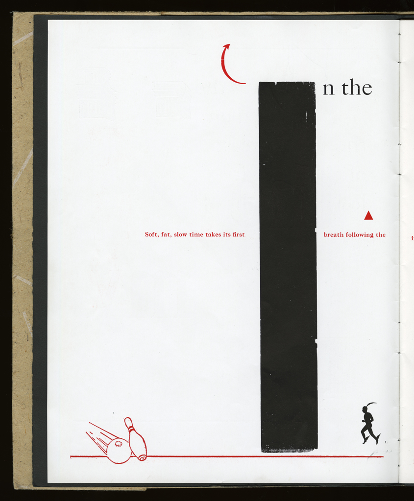
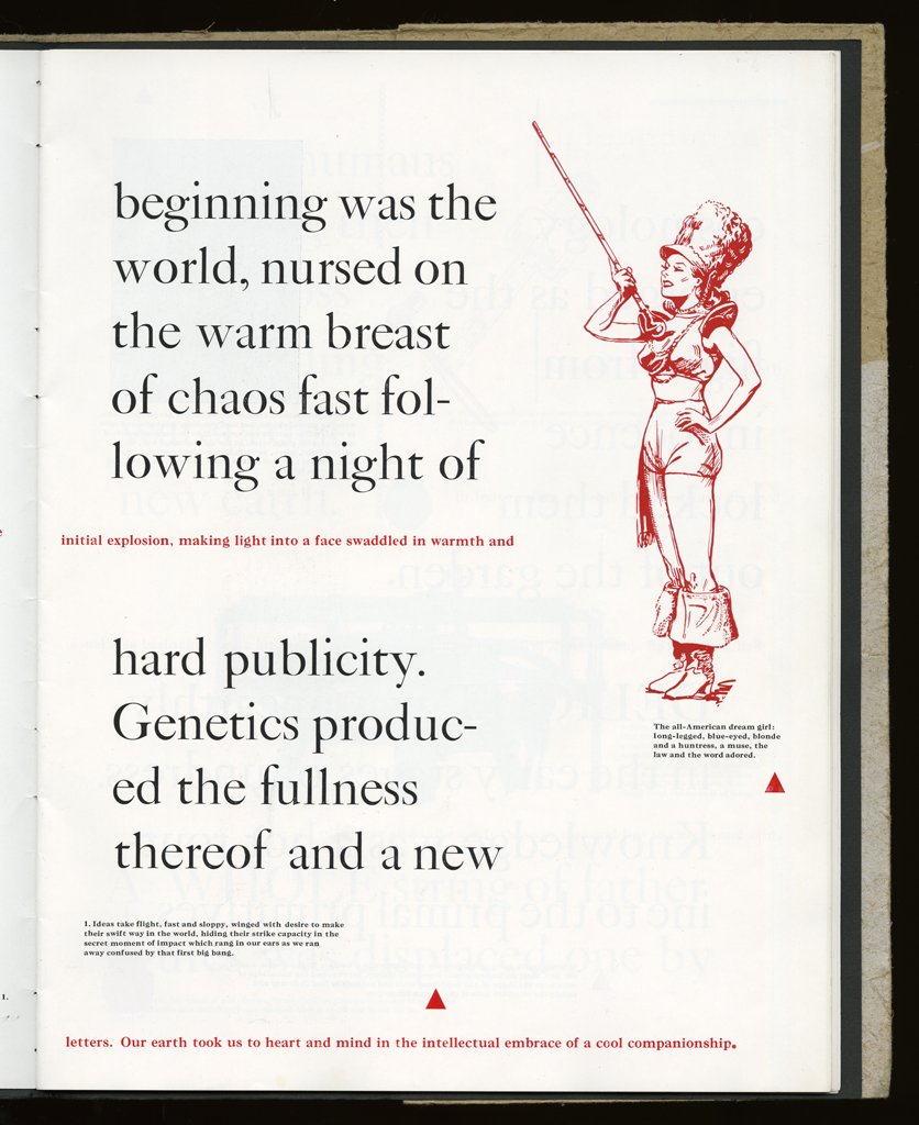
typographic: The type is used to distinguish history from memory, the received and reworked from the personal lines.
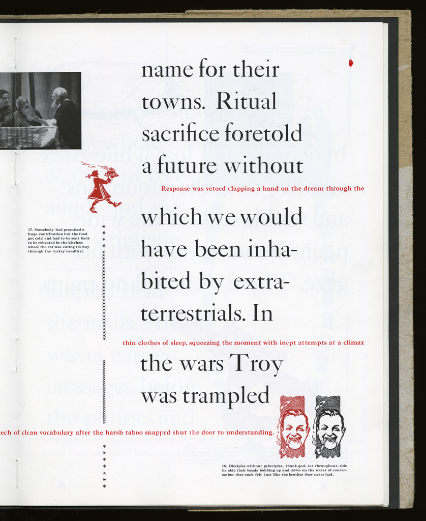
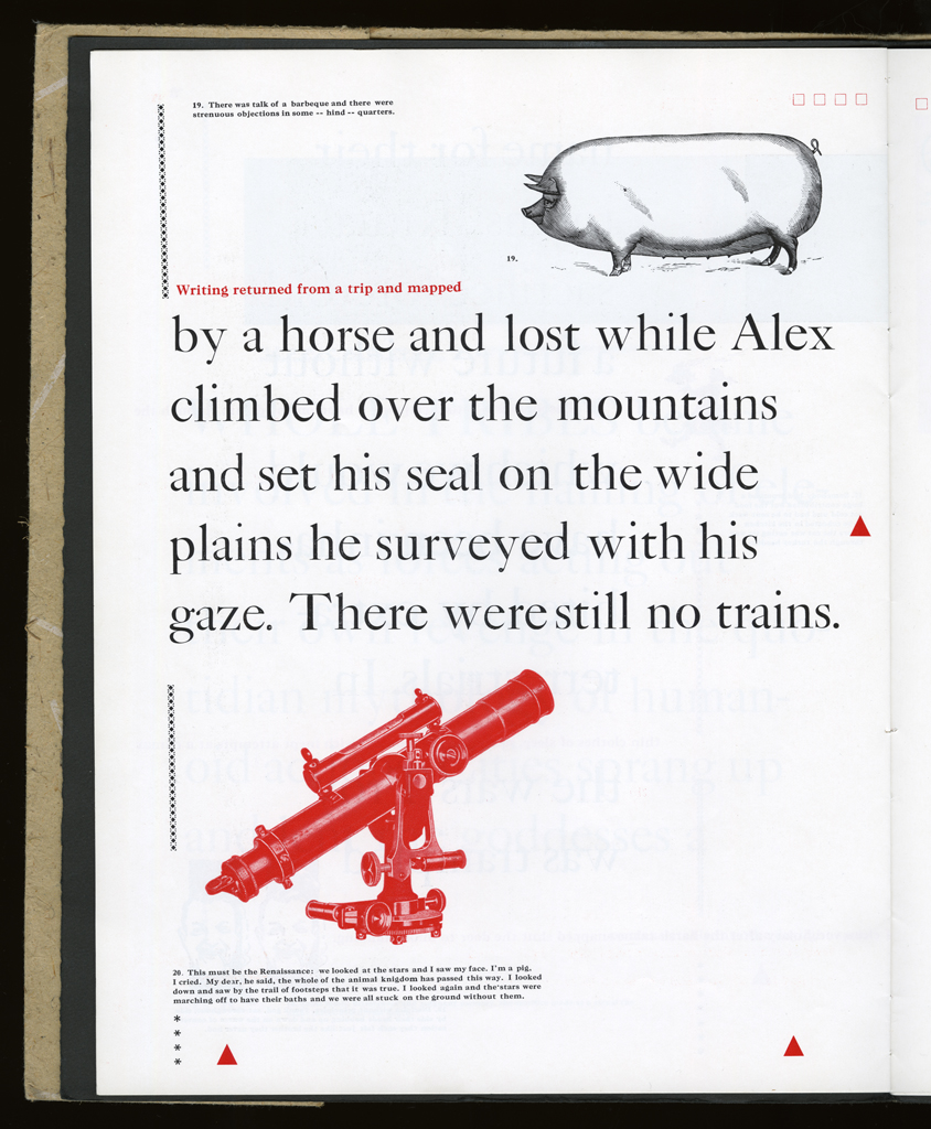
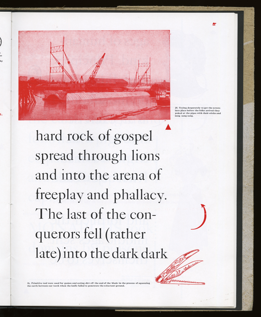
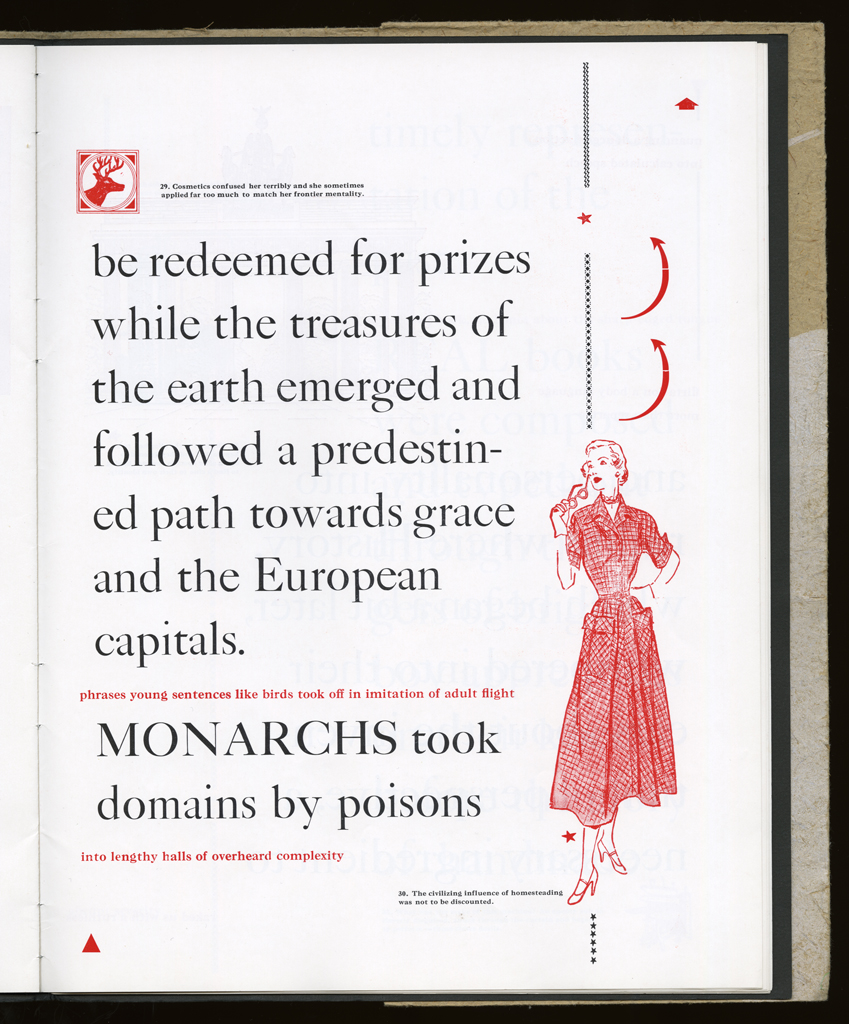
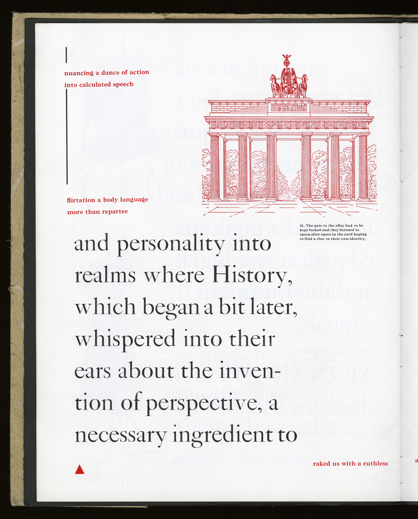
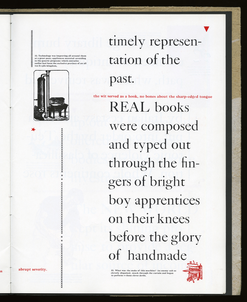
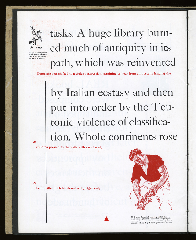
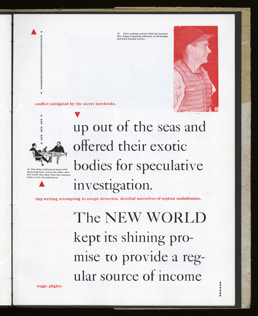
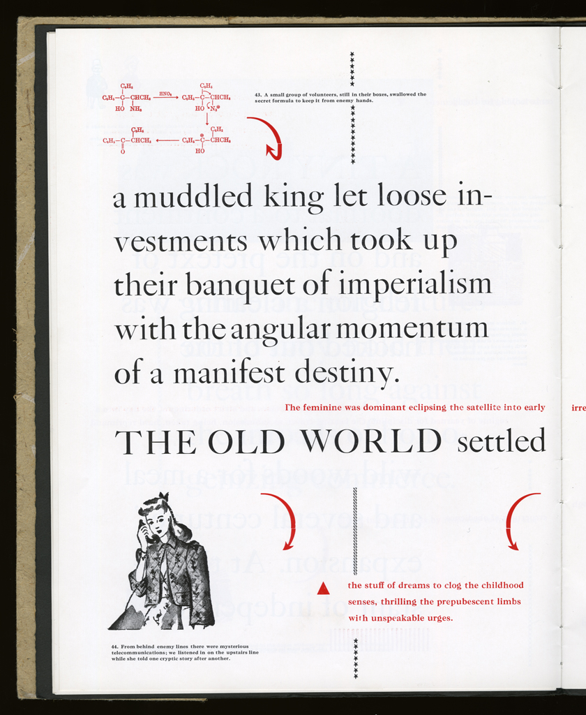
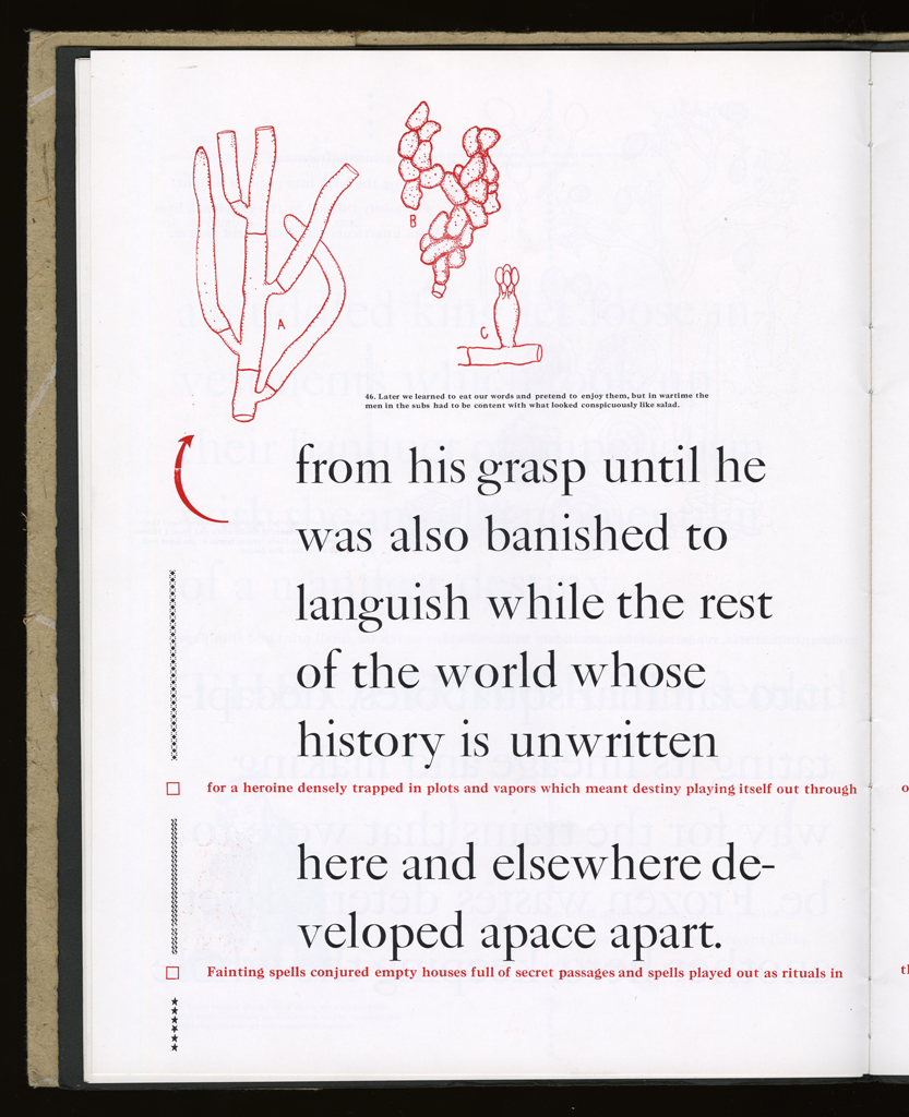
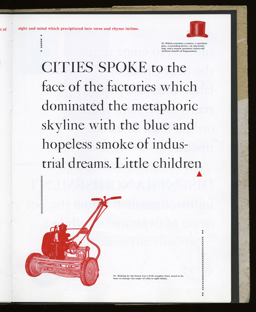
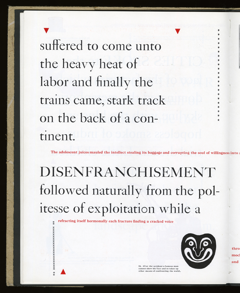
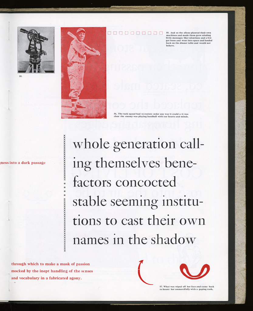
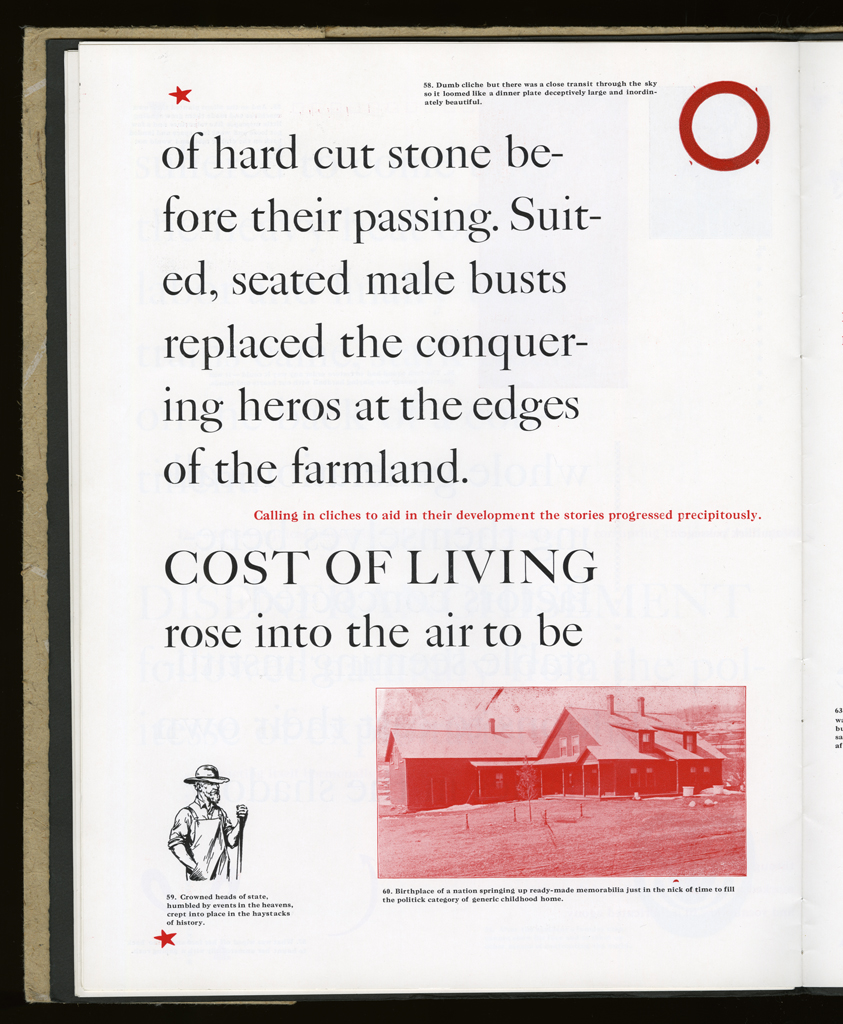
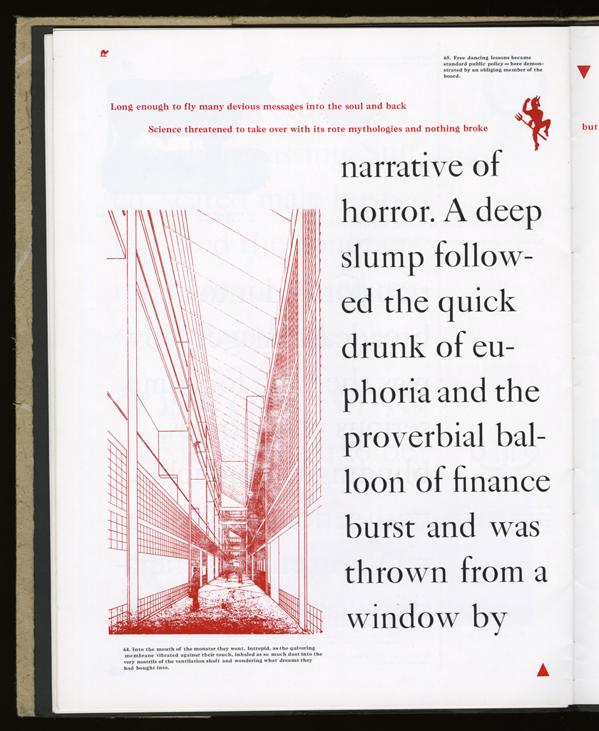
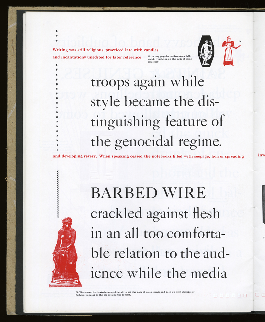
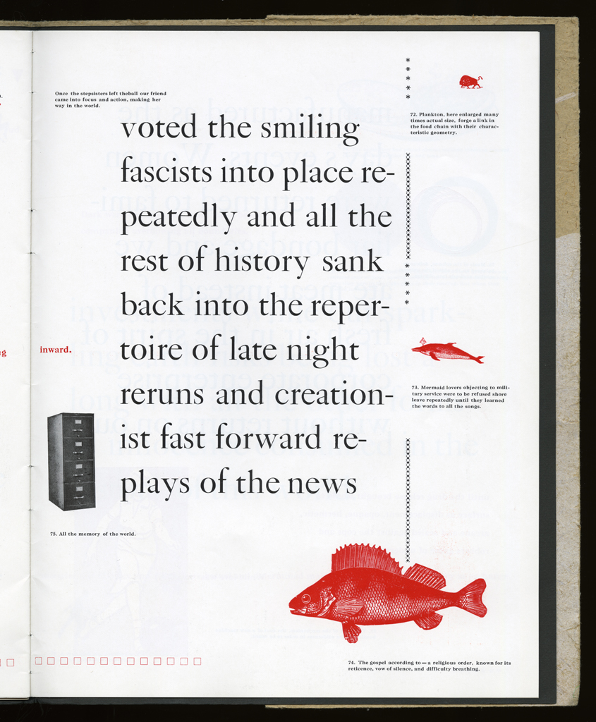
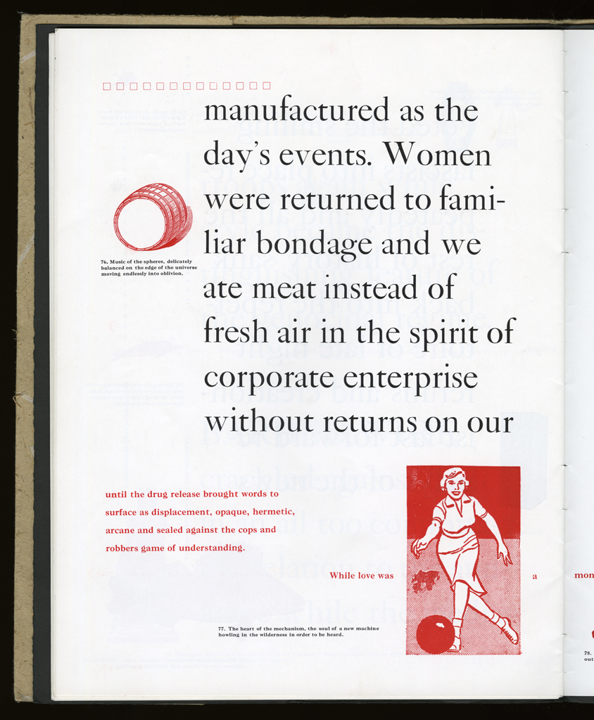
imagery: All found cuts, line and half-tone, all letterpress.
graphical: Borders, dingbats, and other devices help punctuate the page and introduce a sign set as part of the text.
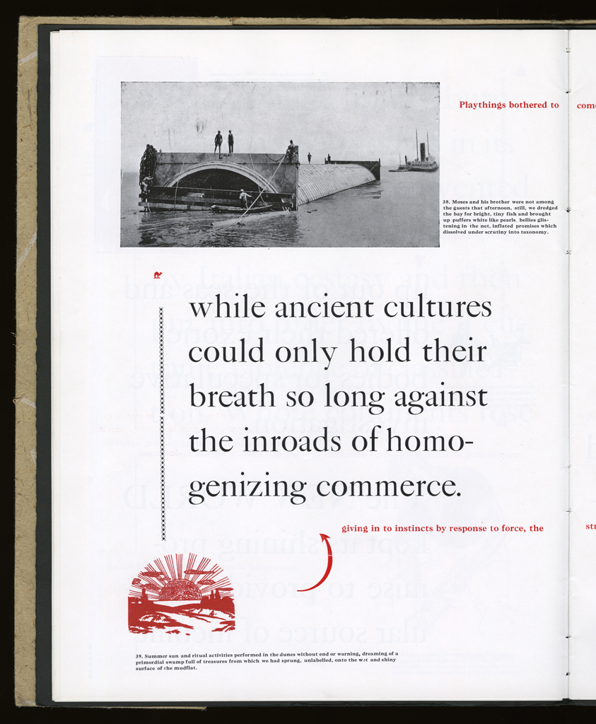
openings: The only page that uses an image across the gutter is a full spread, and it has the photographic cut of the Last Summer tableau.
The intertextual elements of meaning production on these pages are complicated, but visually evident. Conception and execution had a happy relationship in this work.
Johanna Drucker
type: initiating
role:
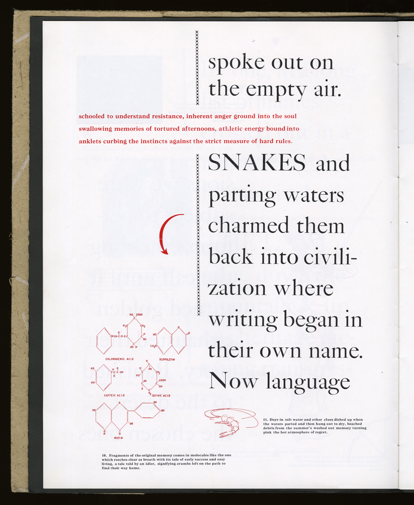
author
printer
designer
publisher: Druckwerk
dates:
publication: 1990-06-00
publisher: Granary
dates:
publication: 1995-09-00
publication history: Two editions of this work were produced.
movement:
unknown
subject:
artists' books (LCSH)
content form:
experimental text (local)
publication tradition:
artists' book (local)
inspiration: Tom Phillips's work inspired me, not A Humument, but some of the works that dealt with sequence as a constraint.
manuscript type: texts
location: artist's archive
note: All in existence.
title note: The many themes of the book are encoded in the title, and the Word/World and the/my oppositions announce the language/knowledge and history/memory oppositions that are crucial to its textual and conceptual dynamics.
edition type: editioned
publisher: Druckwerk
place: Bow and Arrow Press, Harvard University
dates:
publication: 1990-06-00
edition size: 70 copies
note: I loved making this first edition, and Gino Lee was a major presence during its production. Without him it would never have happened. He let me use the Press without restraint and allowed me to return to the Bow and Arrow after I'd moved to New York so that I could continue to print and finish the book.
horizontal: 10" inches closed
vertical: 13" inches closed
depth: .25 inches closed
production means:
letterpress (local)
binding: hand sewn (local) The signatures are bound to cover stock which is folded into the bagasse wrappers. Not perfect, but functional.
substrate:
bookBlock: paper Warren's Lustro
Dull
endsheets: paper Various
media:
ink (local)
format: codex (AAT)
cover: Letterpress on Bagasse, with wood type and linoleum elements.
color: yes Printed in black and red.
pagination: unpaginated
numbered?: numbered
signed?: signed
In fond and loving memory of my mother. At the Bow and Arrow Press, Adams House, Harvard University. Summer 1989 through late Spring 1990. In Caslon on Warren's Lustro dull. Many thanks to Gino Lee and Charles Steele.
reception history: Various people have written about this work, none extensively.
manuscript type: mockups
location: artist's archive
note: All the production materials exist.
manuscript type: texts
location: artist's archive
note: The texts are also preserved in various forms.