





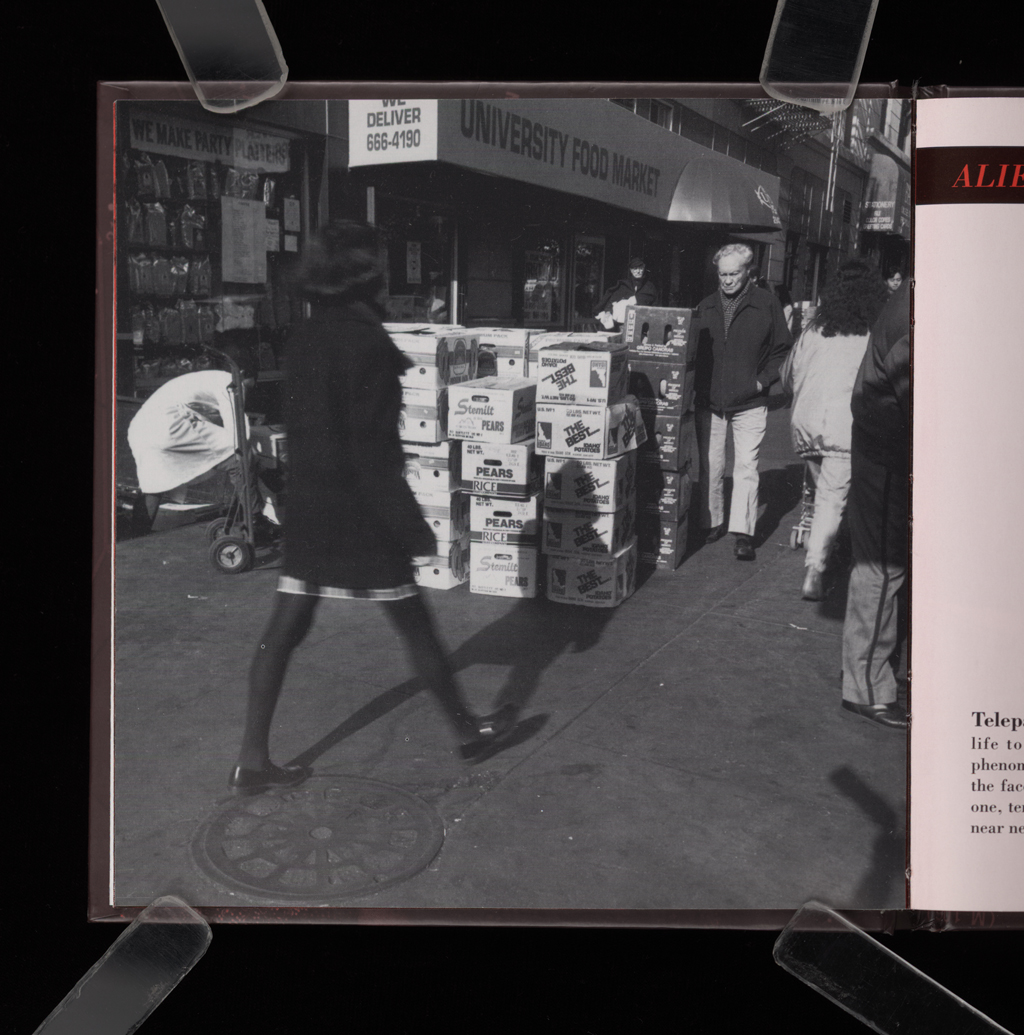
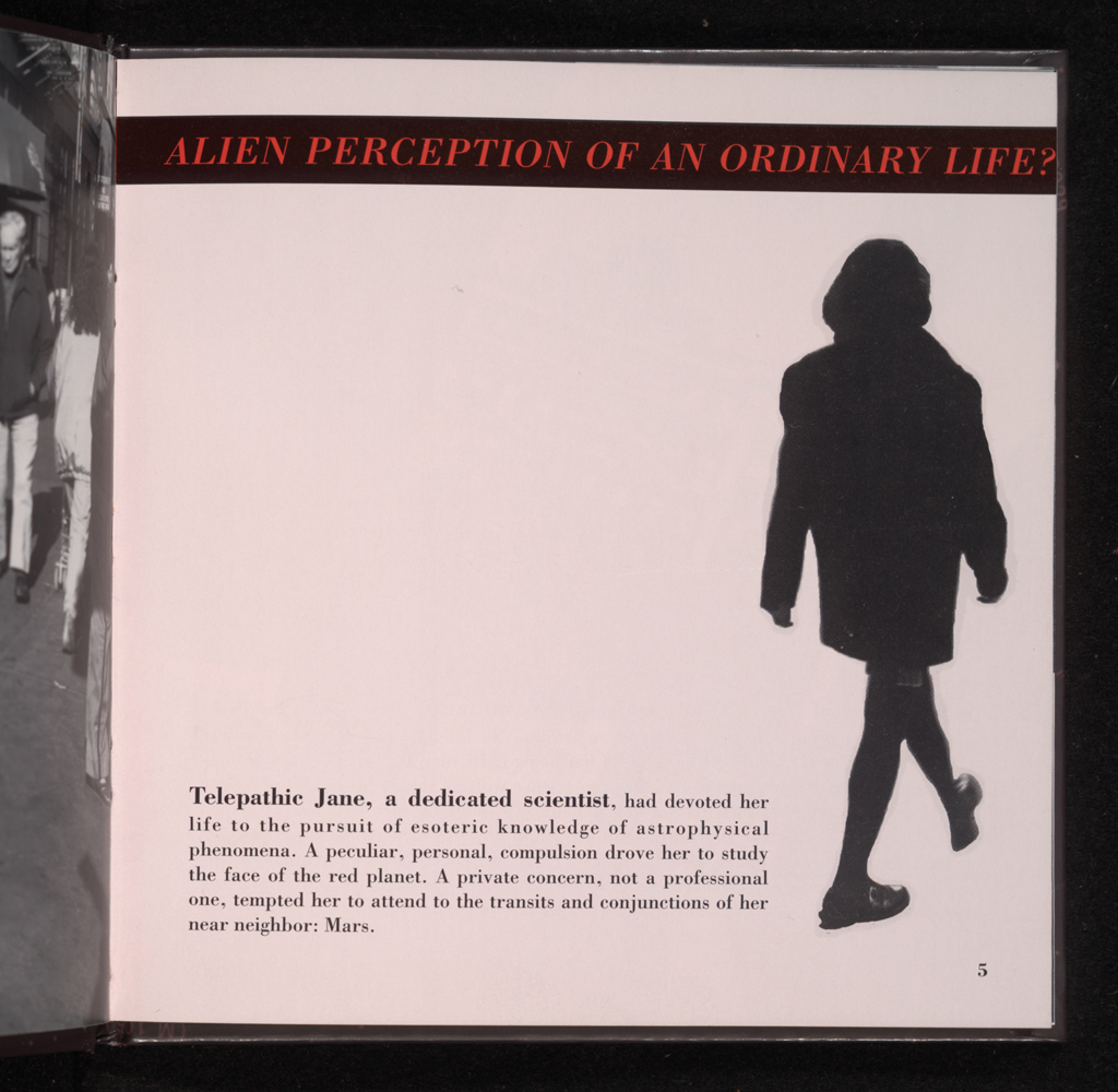

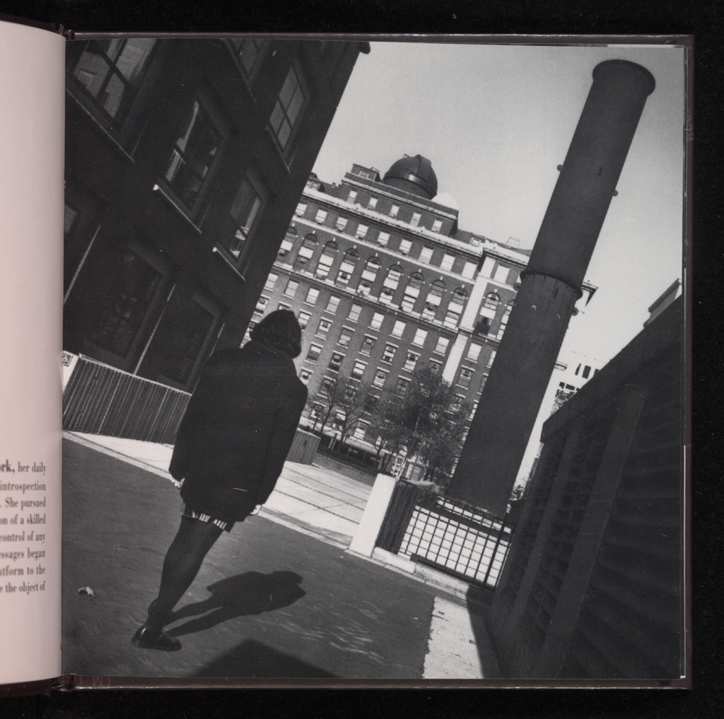


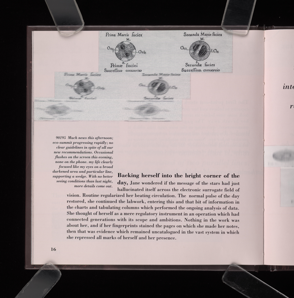
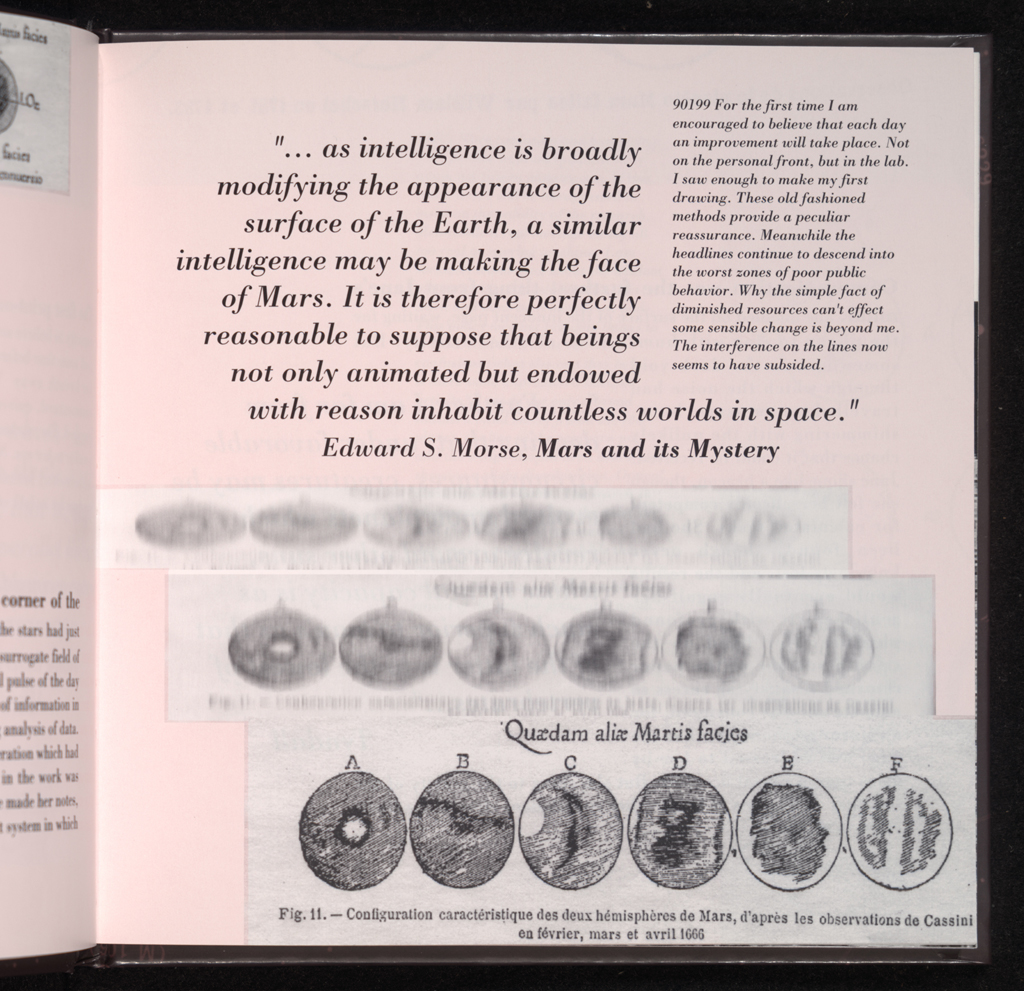


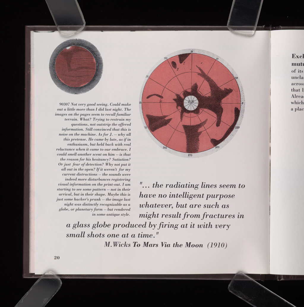
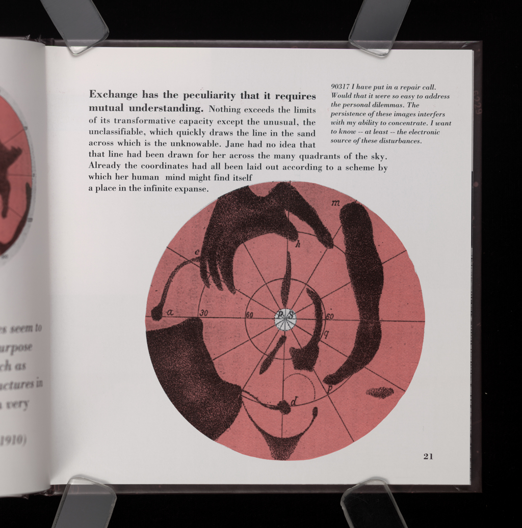
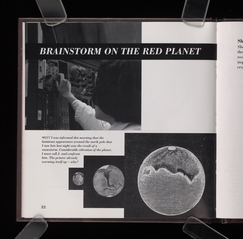


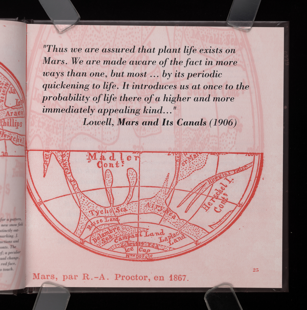


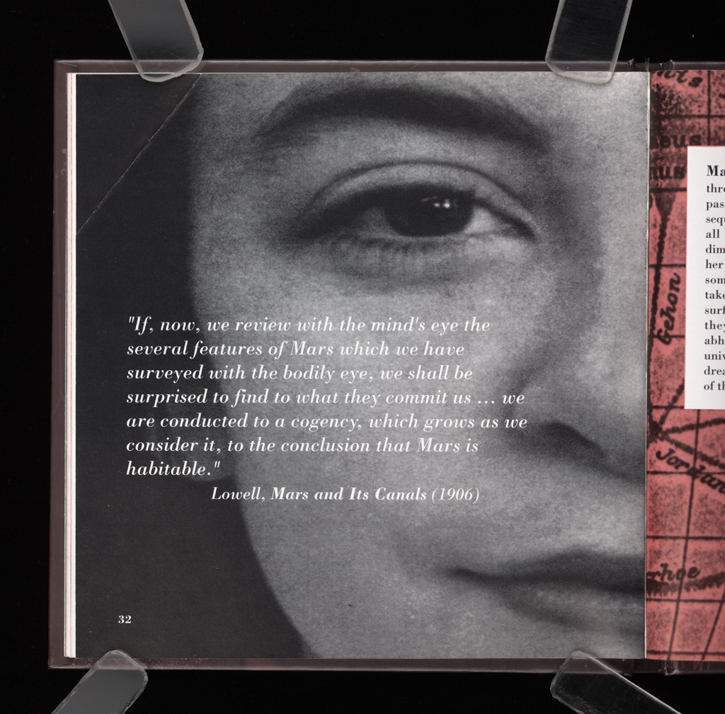


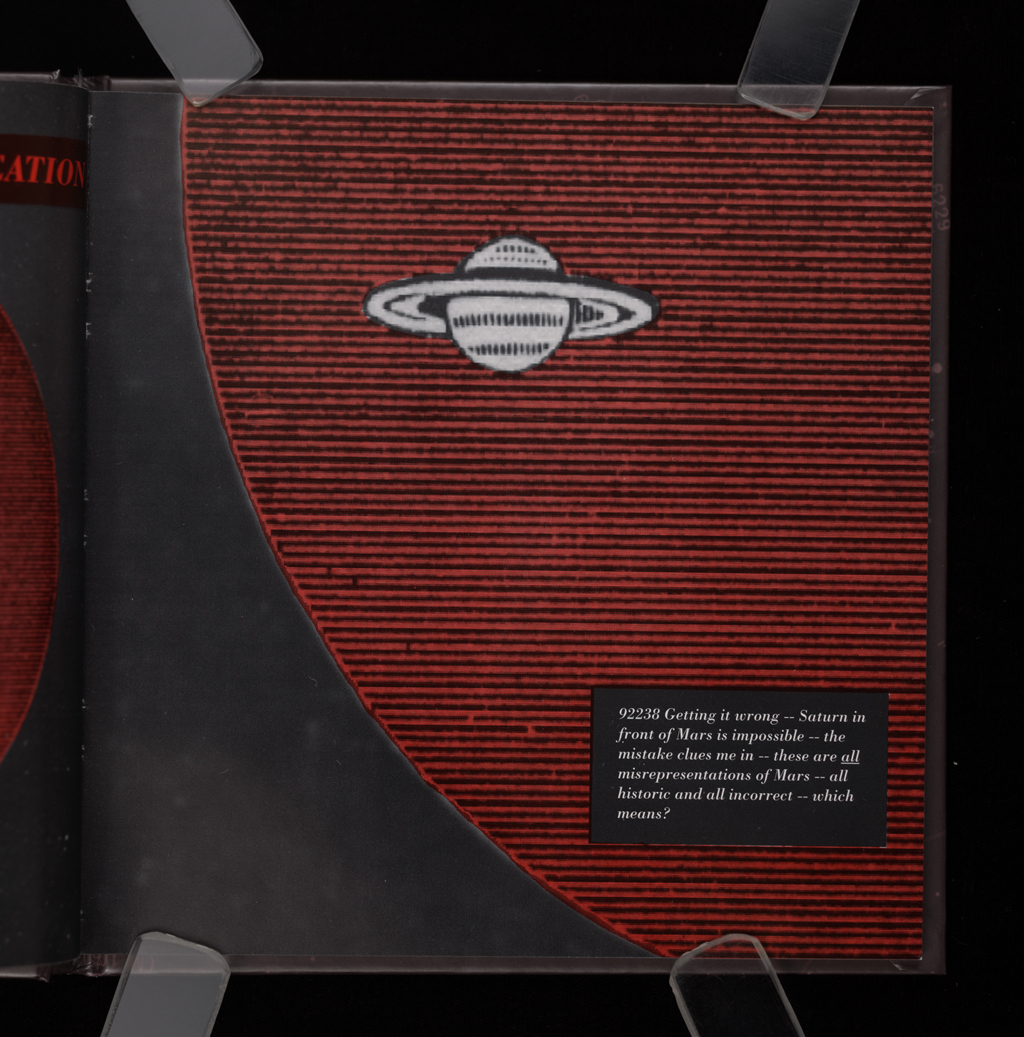

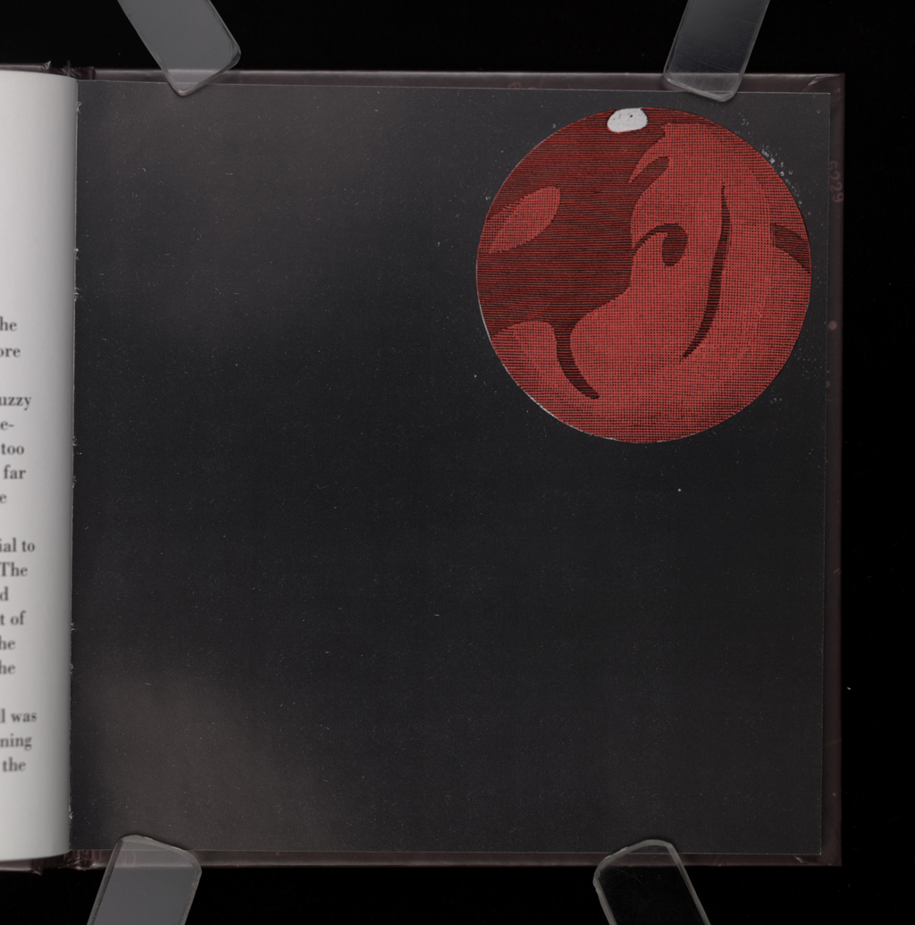


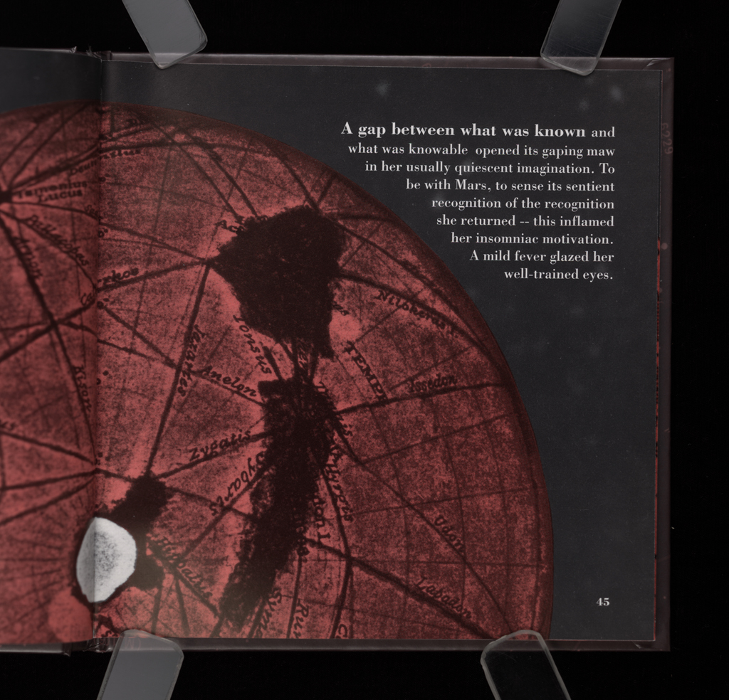


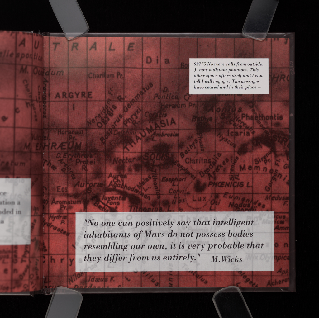





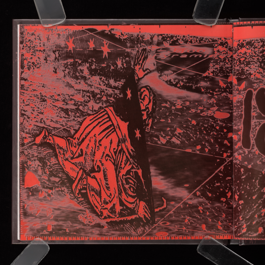


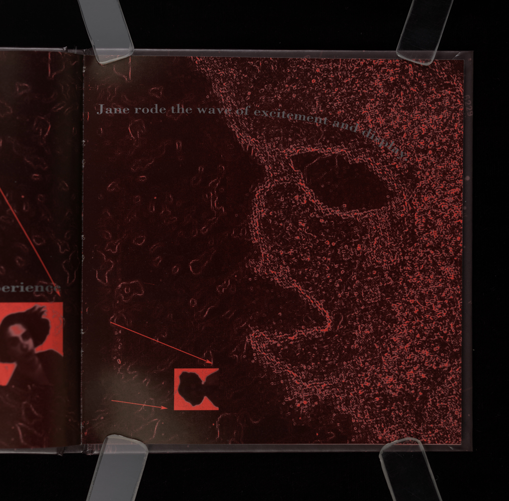

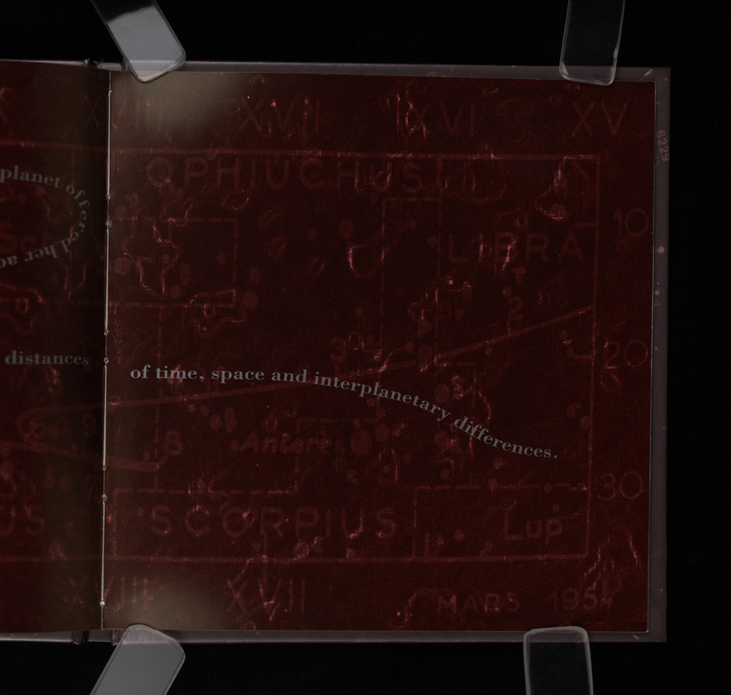
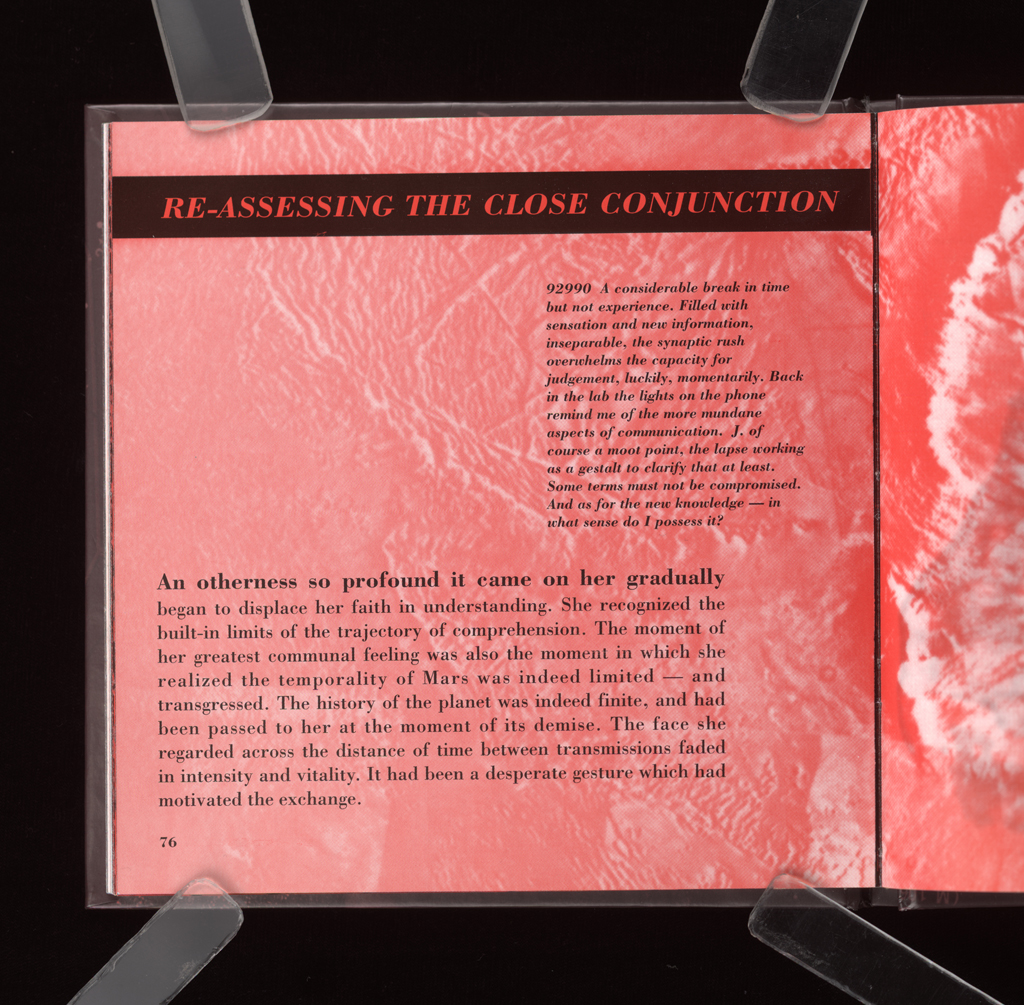










A collaboration, conceived as an artists' project for Nexus Press, the book was overly constrained by the literal narrative structure. When compared to Emerging Sentience (2000) or Nova Reperta (1999), or even Cuba (2005), the book lacks visual and design richness. The idea of the book came to us in the National Air and Space Museum in DC. We were looking at images of the Mars lander and the photo caption included the phrase "Martian topography." Almost simultaneously we said aloud, "Martian TYpography." So the project began. We looked at the history of images of Mars and the corresponding evolution of conceptual understanding of that planet, its surface, character, identity. The history of imaginings and projections was intriguing, as were the images themselves. And of course, there was the divine work of Helene Smith, prodigy of Theodor Flournoy, about the planet Mars and the language of India...Much rich material was used to shape the book, and the images in its pages contain many scanned pieces. All the Mac/Apple, Photoshop, and Quark tools were new and novel. The production for this book took place in 1991, and our first system cost us nearly $8000 for a scanner, computer, monitor, and black and white printer. Brad's explorations of digital capabilities expanded the project, and gave it whatever beauty and design richness it has. The pages are nicely enough laid out otherwise, and the book has a neat, small format, but between the newness of our relationship and the difficulty of trying to make a shared vision cohere, the project remained, I think, more conventional than had either of us done it on our own. As a book about emerging sentience, that of the planet and its exchange with Jane, the scientist (played by an Art History grad student who shifted to medical school), the book has themes that come and go from various of my writings and, obviously, another of our later projects.
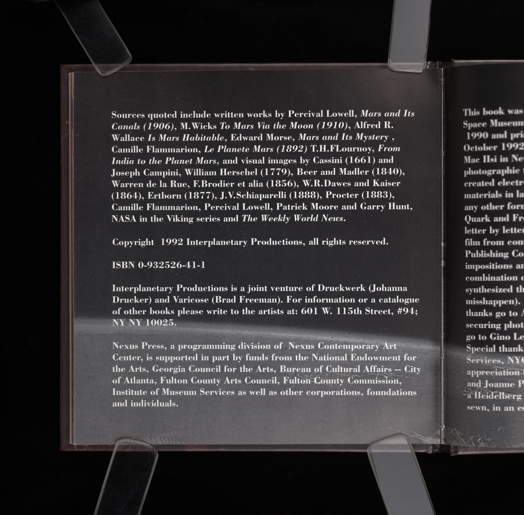
This work was printed at Nexus Press in Atlanta, in October 1992. It was produced on a Mac IIsi using various computer and photographic technologies including Photoshop, Word, Quark and Freehand. The work was Imageset to negative film from computer files by the Microcomputer Publishing Company (MPC) in New York, sometimes as full page impositions and duotones. The book was printed on Heidelberg KORD on Warren's LOE dull coated, alkaline, smythe sewn, in an edition of 500 copies.
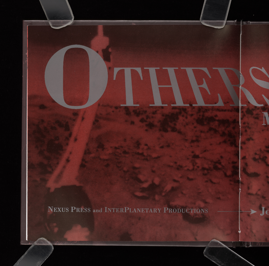
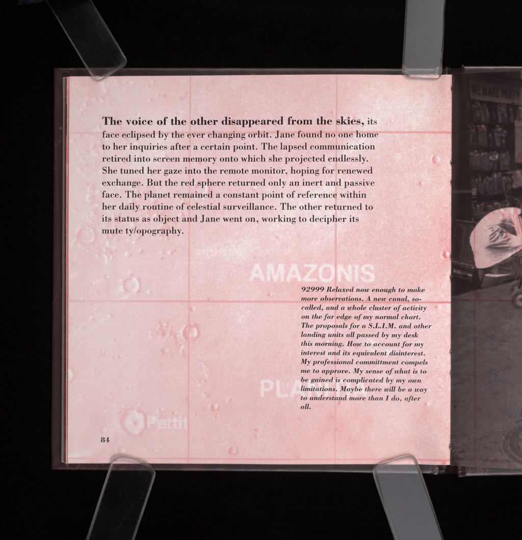
typographic: Playing with conventions of book and narrative format, very 1960s French nouvel, and using Bodoni for its clean, clear, classicism.
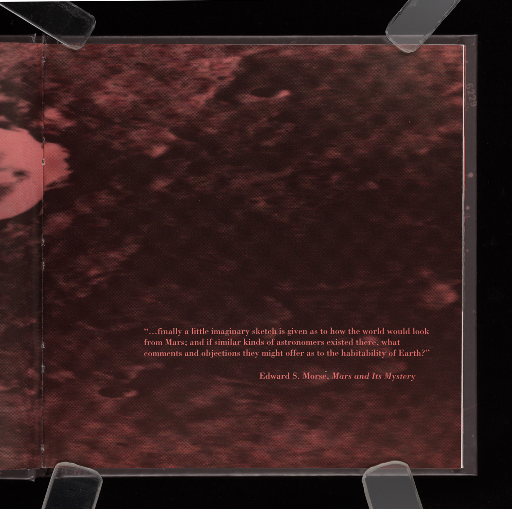
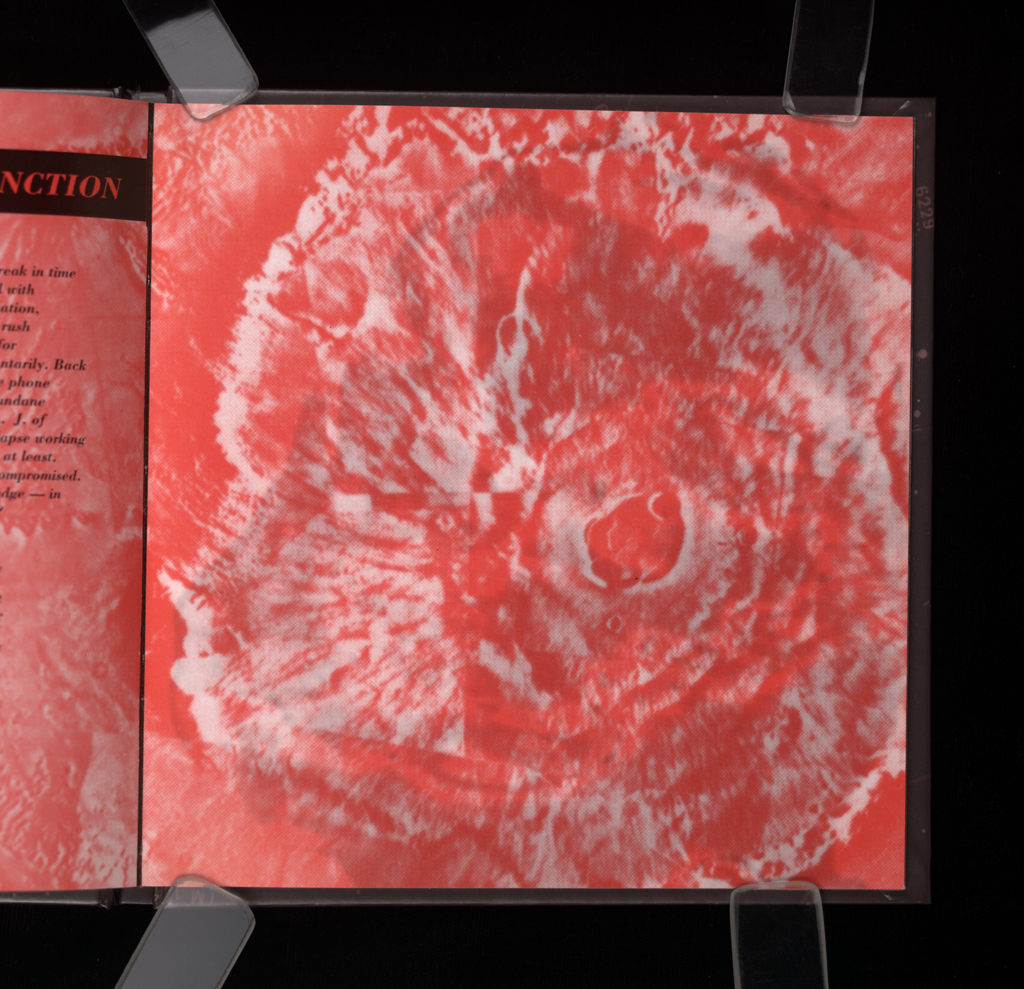
imagery: The images range from regular photographs to Photoshop manipulations, from researched and archival materials, to things we created for the book specifically. The book is meant to have a "look" to it at the outset that recalls 1960s travel books and other non-fiction forms.
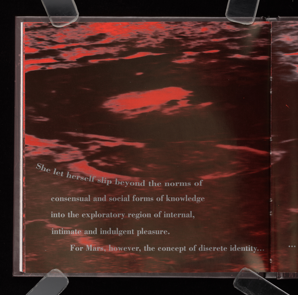
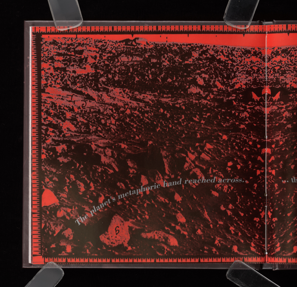
graphical: A structured layout that gradually breaks down, the format signals, as does the color, the transformation of Jane's state of mind.
openings: As with the rest of the design, these progress from standard to unusual to reinforce the plot as effect.
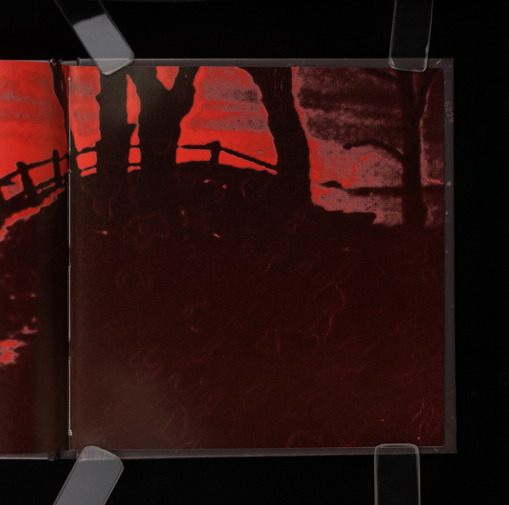
turnings: Only later in the book do the turnings become dramatic as the normative layout dissolves and the color shifts peak.
development: Narrative, graphic, design, and color all reinforce each other in a gradual dissolution of boundaries and peak experience.
sequence: A contrast between the earlier, staid, conventional sequence and those in the last sections of the book shows the dramatic shift in the events.
other features: Color plays a major narrative and design role in this book.
Since narrative is a force in this work, the emphatic underscoring of its trajectory by the design and the use of color are both important moves within the design. This book has certain classic features of an artists' book project, not the least of which is the fact that it didn't exist in advance of being plated and printed. No other version, even a proof, exists of the book showing the color and its effects. In that regard, this book is a carefully made and exquisitely detailed object. The design page by page is very careful, balancing the typographic elements and images so that they really work together as a whole while existing in active dialogue to create a peculiar system of belief and unbelief, pseudo-document and fiction.
Johanna Drucker
type: initiating
role:
author
designer
Brad Freeman
type: initiating
role:
photographer
printer
publisher: Nexus Press and Interplanetary Publications
dates:
conception: 1990-00-00
production: 1990-00-00:1992-00-00
publication: 1992-00-00
publication history: Published by Interplanetary Productions and Nexus Press. Interplanetary Productions is a joint venture of Druckwerk (Johanna Drucker) and Varicose (Brad Freeman). [A. Schutte]
subject:
artists' books (LCSH)
themes: Sentience, gender, ecological awareness, interplanetary communications.
content form:
narrative (local)
experimental text (local)
publication tradition:
artists' book (local)
inspiration: The caption to the photograph of the Martian rover in the Air and Space Museum in DC, "Martian topography."
related works: Emerging Sentience and, also, Narratology, Mind Massage, and Simulant Portrait -- the books of mine that address women, narrative, awareness, gender, and conventions, some with sci-fi themes, some with genre issues.
other influences: The images and texts from the history of astronomical observation of Mars.
community: press Nexus Press was the place the book was produced, printed, bound, and distributed.
note: Very much an artists' book, something which could not or would not find a publisher in a commercial venue.
manuscript type: mockups
location: artist's archive
note: Many extant, including design trials and variants.
manuscript type: texts
location: artist's archive
note: Many extant.
manuscript type: other
location: artist's archive
note: Source materials, research, images, and photos are all extant.
An enormous amount of work to produce, the book wasn't quite successful. The costs for its production were never recouped. I believe the letterpress version of History of the/my Wor(l)d helped pay for this book.
title note: The pun in the title was reinforced by the orthography, a favorite technique.
edition type: editioned
publisher: Nexus Press and Interplanetary Publications
place: Atlanta, GA and New York City
dates:
conception: 1990-00-00
production: 1990-00-00:1992-00-00
publication: 1992-00-00
note: Interplanetary Publications was a name we made up to have an identity for our collaborative work. We didn't use it again, and then switched to JABBOOKS once Brad started publishing the Journal of Artists' Books.
horizontal: 6.7 inches closed
vertical: 6.8 inches closed
depth: .4 inches closed
production means:
offset (local)
binding: smyth sewing (AAT)
substrate:
bookBlock: paper Warren's LOE dull coated
media:
ink (local)
other materials: none
general description:
format: codex (AAT)
cover: Trade bound and covered in a grim film that dulled the colors and flattened the look of the book.
color: yes
pagination: paginated 100 pages
numbered?: unnumbered
signed?: unsigned
This book was conceived at the National Air and Space Museum in Washington D.C. in December 1990 and printed at Nexus Press in Atlanta, in October 1992. In the interim it was produced on a Mac IIsi in New York City using various computer and photographic technologies. The pages of this book were created electronically making use of all manner of source materials in labor-intensive manipulations. The images do not exist in any other form but were created here as originals. Photoshop, Word, Quark and Freehand programs were used in the process, sometimes letter by letter or pixel by pixel. The work was Imageset to negative film from computer files by the helpful staff at Microcomputer Publishing Company (MPC) in New York, sometimes as full page impositions and duotones. Brad Freeman created the images in a combination of traditional and electronic darkrooms; Johanna Drucker synthesized the text and rendered it in Adobe Bodoni (sometimes misshappen). Pre-press production took about 1200 hours. Special thanks go to Amy Komisarek for allowing us to use her image and for securing photo sites. Thanks to Layren Miller for her alphabet. Thanks go to Gino Lee for him usual sage advice on all matters technical. Special thanks to Anne Noonan, Steve Hudson and Al Wiener at Soho Services, NYC, for space, time, and interest. finally, much appreciation to Nexus Press for a press grant and to Michael Goodman and Joanne Paschall for their kind assistance. The book was printed on Heidelberg KORD on Warren's LOE dull coated, alkaline, smythe sewn, in an edition of 500 copies.