


This project was conceived as a set of combinatoric elements for production of weird narratives. The blunt, declarative sentences and the highly iconic images were meant to comprise semantic units. The difficulty is that no momentum could be created as a result of stringing them together in sequence. They remain beads on a string, oddly self-contained. That property, combined with the all-out oblique weirdness of their content, made the project somewhat obscure in terms of that original conception.
This "book" was produced in a dark period, when I was working for the East Bay Regional Park District at the exhibition design facility in Alameda. A good job, with nice people, but the hours were long and I felt the difficulty of the way this cut into time for making books or writing. So this project was conceived as a way to counter the desperate sense I had that I wasn't making anything at all. The drawings could be done in a day and so I could work on them in the morning, even with my boss picking me up at 6:30 am. The captions were produced on one of Tamia Marg's dad's typewriters. In those days, access to an IBM selectric was the closest I could get to typesetting. And I appreciated it. The ironies in the image and text relations echo the alienation I felt at that point. I was so unsure about where I was, what I was doing. I'd been in Europe for two years, come back by way of Phila., and then returned to California to live in the warehouse with Tamia, Julie, and Diane. Making a living turned out to be much harder than it had been when I'd left. And in general, the transition from the travel mode, with all its independence and lack of real responsibility (albeit, also, poverty) took a toll.
typographic: Printed entirely with a single monospace font in all caps.
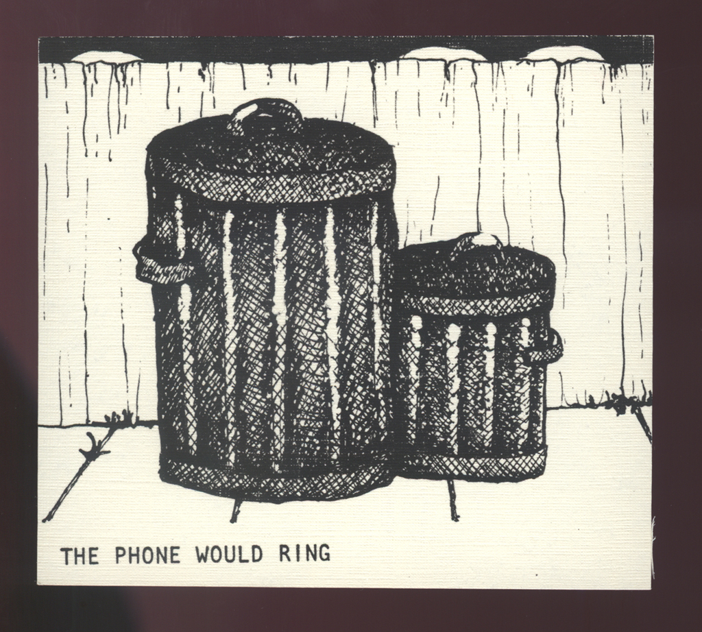
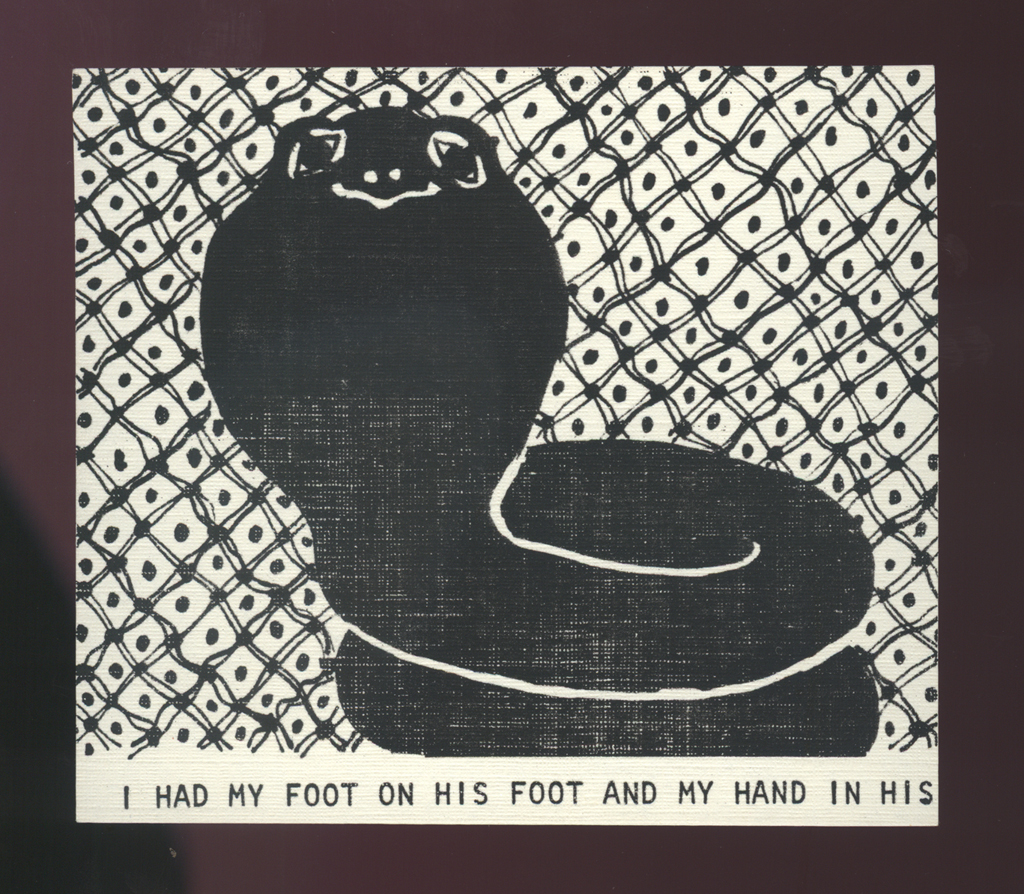
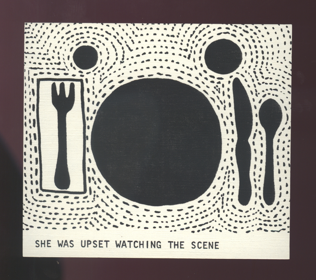
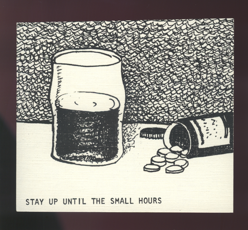
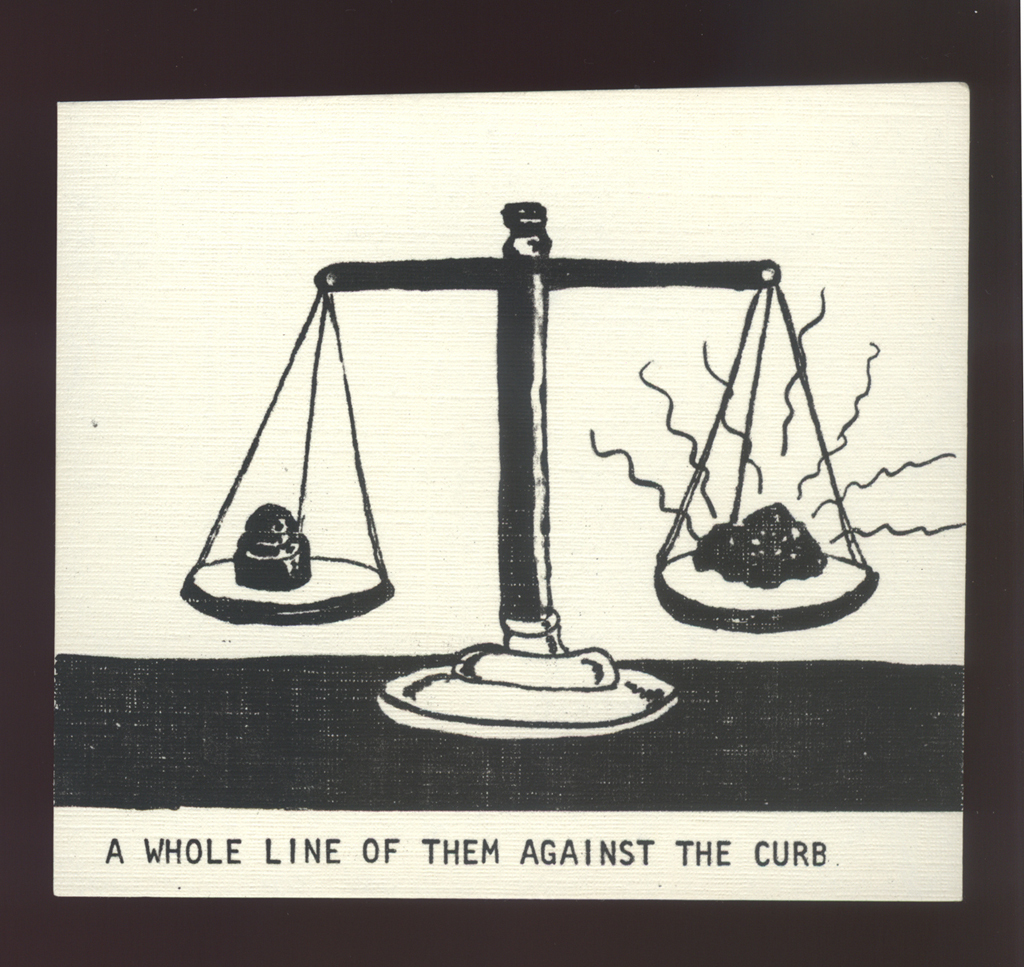
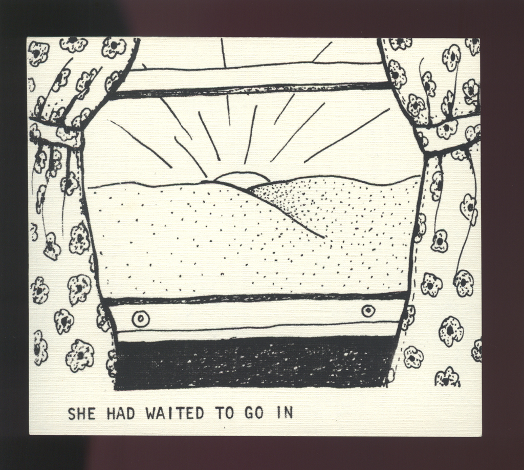
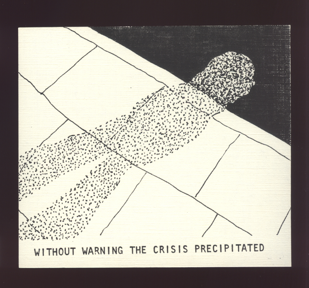
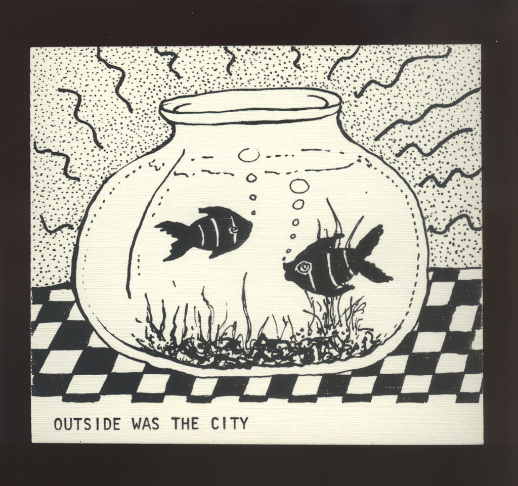
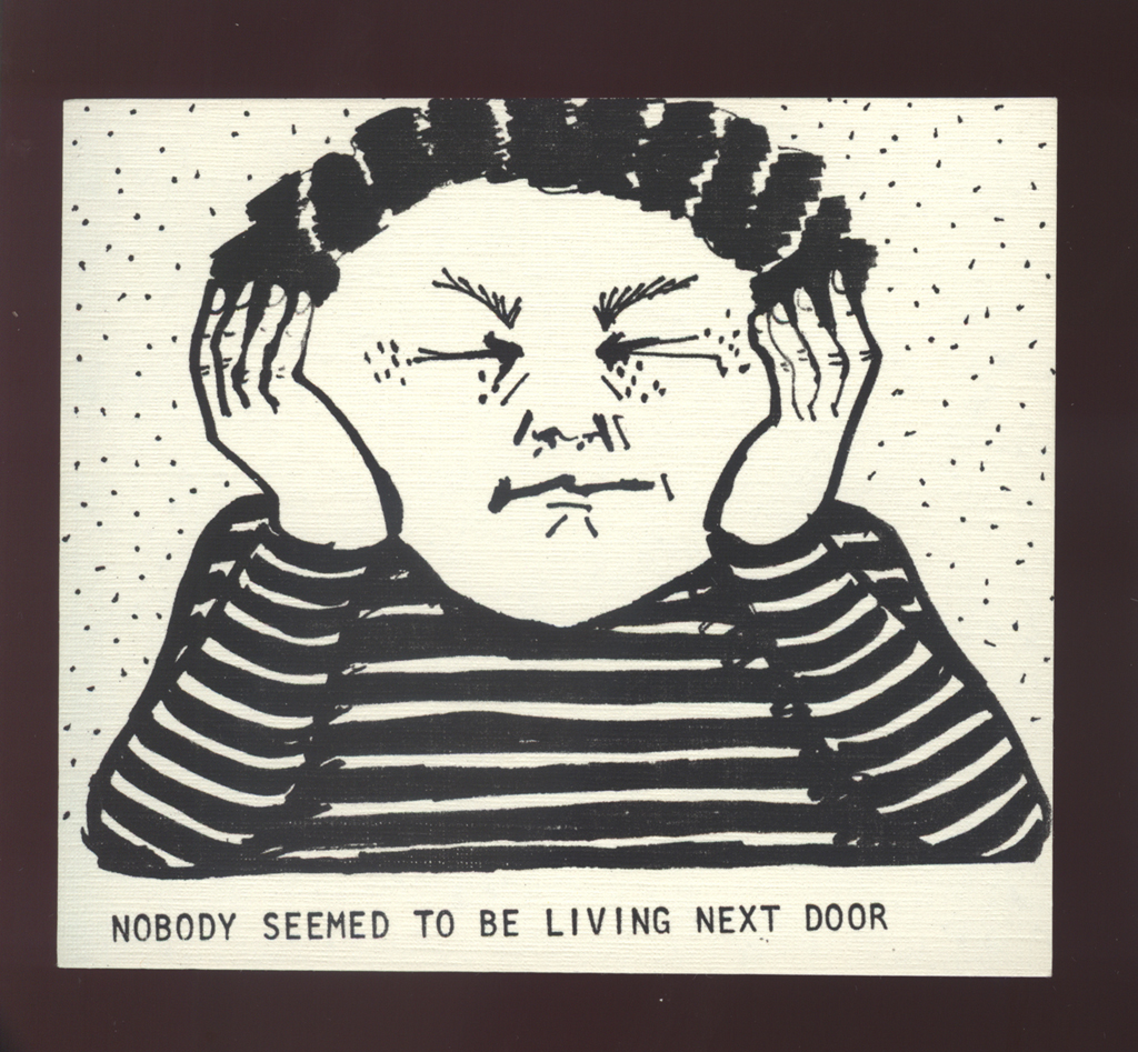
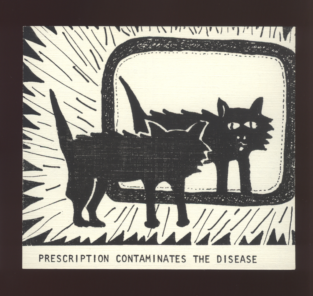
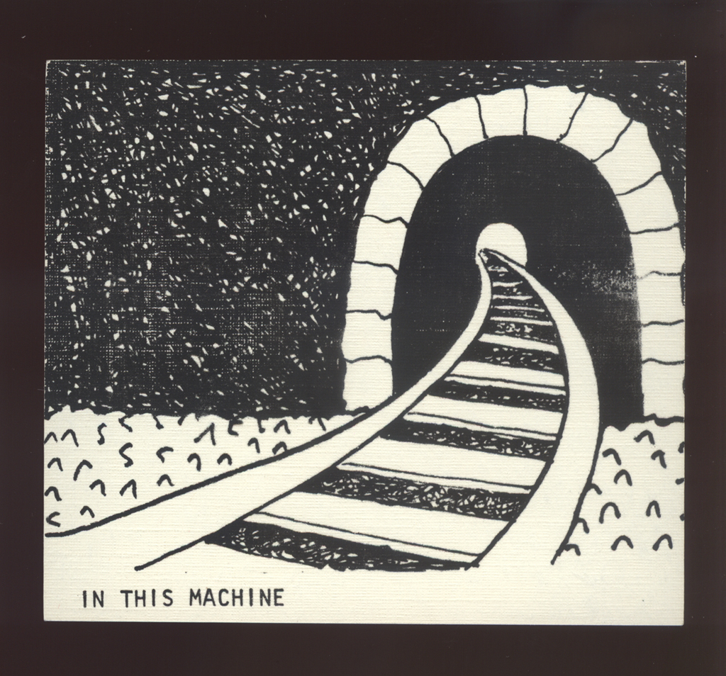
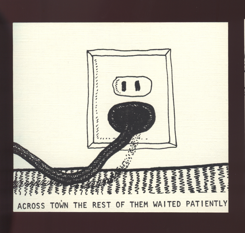
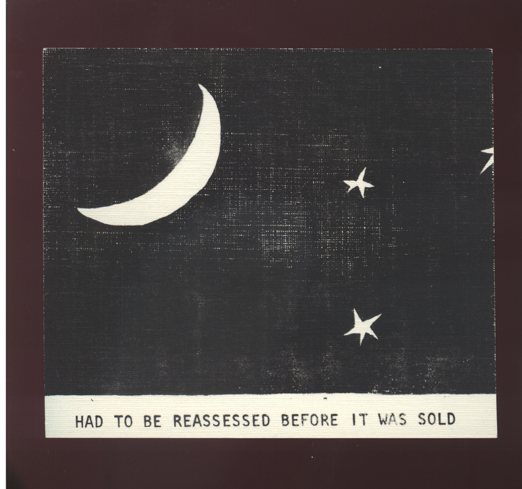
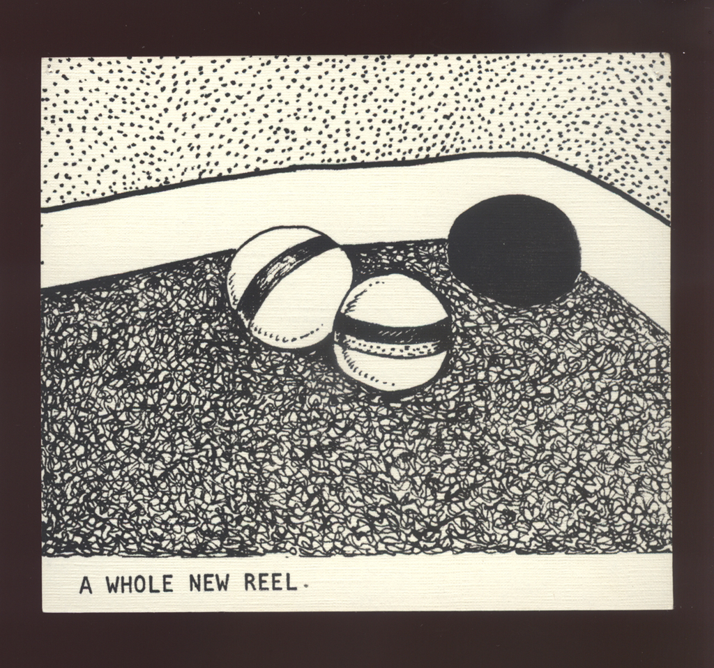
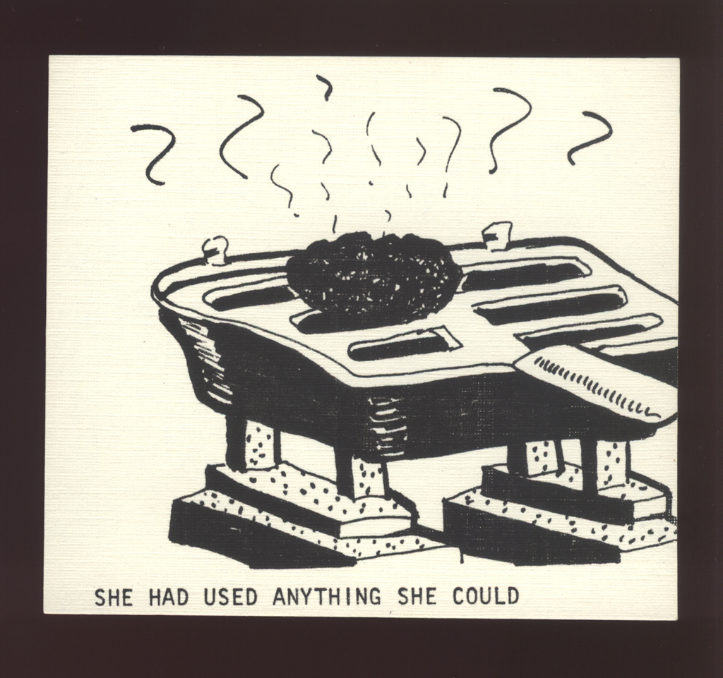
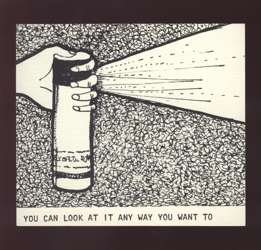
imagery: Images are all line art - usually ironic depictions of ordinary objects and occurences.
graphical: Cards are all laid out in the same format with image on top and a single line of text below.
turnings: The cards were intended to be able to be combined into a quasi-narrative, but that never quite worked.
other features: This project never quite had a formalized presentation -- no box, container, or any other wrapping, just plastic bags and rubber bands, which gives some indication of my own attitude towards it.
The best thing about this work is its tone. I'm still fond of the irony and the just plain weirdness of it. Someone once suggested it would make a good cartoon panel for a weekly paper -- just one panel at a time, for the sake of the strangeness. Maybe so.
Johanna Drucker
type: initiating
role:
author
printer
designer
publisher: self-published
dates:
publication: 1982-00-00
publication history: Barely "published" in any sense. A limited number of these sets were made.
subject:
artists' books (LCSH)
themes: The juxtaposition of short out-of-context-phrases with images that contrast ironically with the text. [A. Pratt]
content form:
experimental text (local)
publication tradition:
conceptual (local)
inspiration: Combinatoric works, such as cut/slit books for children.
related works: Drucker, "Sample Dialog" [A. Pratt]
related works: In drawing terms, and sensibility, this is close to Just As.
other influences: I suppose Edward Gorey and Gary Larson, but only remotely.
note: This work is a stack of paper cards. [A. Schutte]
manuscript type: mockups
location: artist's archive
note: The boards are still in existence in the artist's collection. Not sure what adhesive was used to make them, however, so they may be stained. I haven't looked at them in years.
This project was conceived as a way to keep working on a project by designing it as a set of small, modular elements that could be done in an ongoing way and accrete into a final work. "It Happens Pretty Fast" is the phrase on the card with a picture of the front end of a car on a road with a dotted center line.
edition type: editioned
publisher: self-published
place: Oakland, California
dates:
publication: 1982-00-00
edition size: Small. Very small. Maybe ten copies?
note: Produced in a very small number of sets.
horizontal: 2.9 inches closed
vertical: 2.7 inches closed
production means:
offset (local)
xerographic (local)
binding: other unbound
substrate:
bookBlock: paper
media:
ink (local)
general description: Each card was made with ivory colored paper. On the front of the card there is an image with one line of type underneath it; the back of each card is blank. There are 64 cards total, and there does not appear to be any particular order to them.
format: cards (local)
cover: none
color: no
pagination: unpaginated 64 cards
numbered?: unnumbered
signed?: unsigned
none