


This book was conceived as a typographic fugue, a work in which each new graphic theme was taken up, played with, and incorporated into those preceding. The book was inspired in part by the absolutely beautiful Caslon type we had acquired at UC Berkeley for use in the Architecture School, Visual Studies studio. The text is a polemic against the limits of language as the defining boundary of experience or sentience. The book was done in the final months in which I was in Berkeley, finished as I finished my Ph.D. work in Ecriture, and as I completed the work on my dissertation on avant-garde and experimental typography.The point of the project was to use material means, typographic possibilities, to proliferate meaning within a single text.
The technical feat of this book is apparent to any letterpress printer. The justification of these pages became increasingly complicated, since the paragonnage (multiple point sizes in and across lines and words) demands complicated spacer arrangements if the lock-up is going to work at all.But the technical features had other implications for the composition of the text, since the alignment of words across lines by letters meant that sometimes a text had to be changed in order to find correspondences that could be locked into the spatial arrangement -- as in a crossword puzzle or jigsaw. I worked on galleys, from small units to larger ones, making up the pages as a whole, rather than using a composing stick. I left the sheets unbound, in an album type cover, as per inspiration from the work of Ilia Zdanevich, but it was a most inadequate solution. Later, in New York, I had the remaining 5 or 6 copies bound professionally so they could be sold.
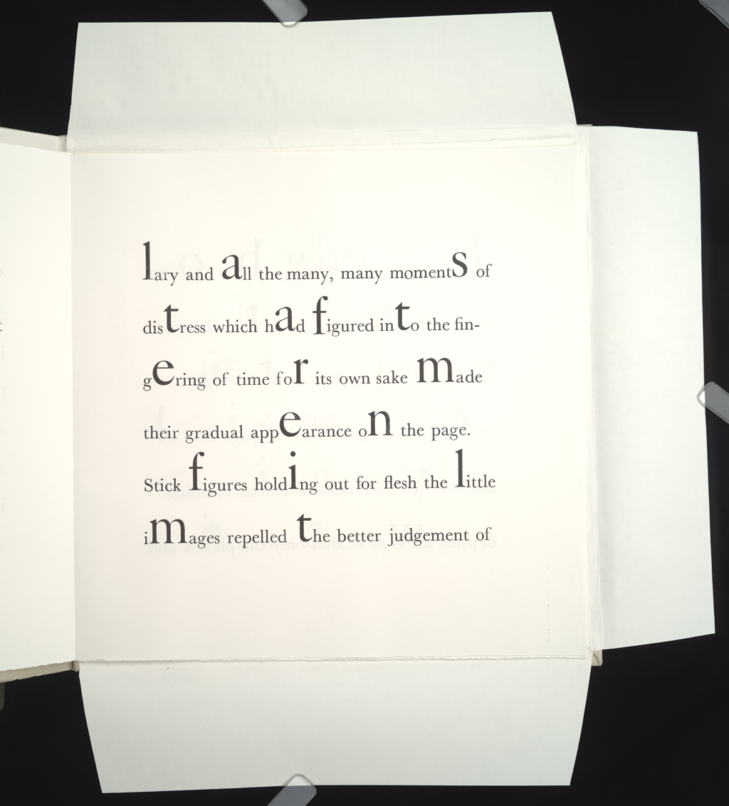
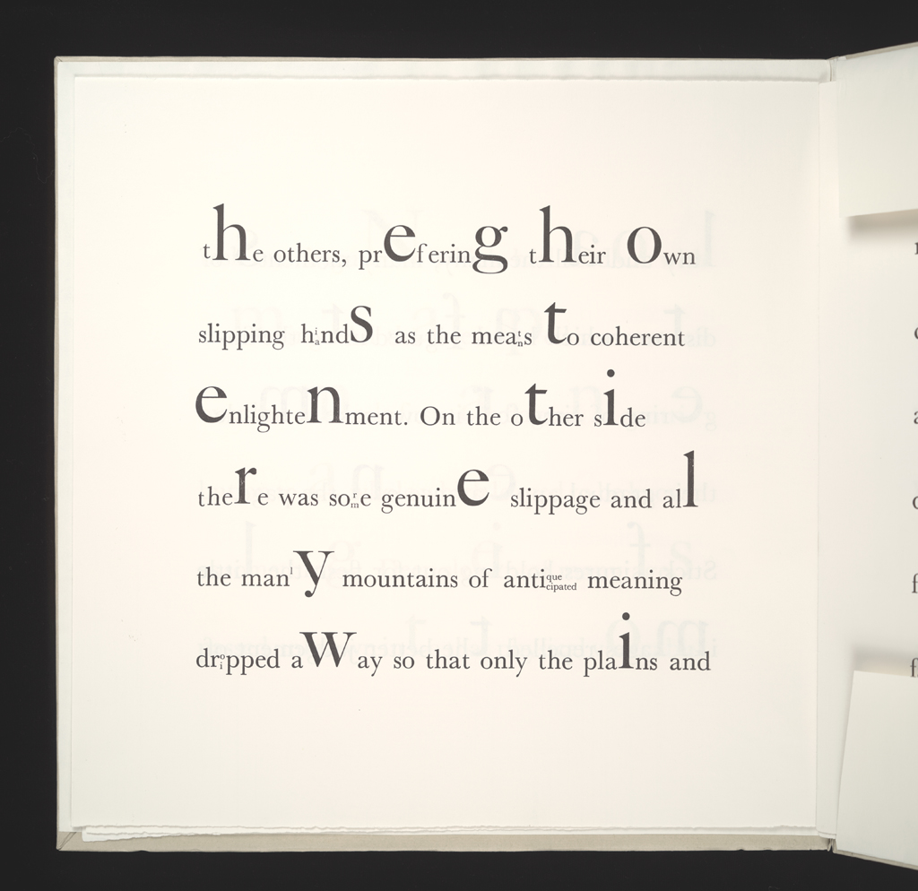
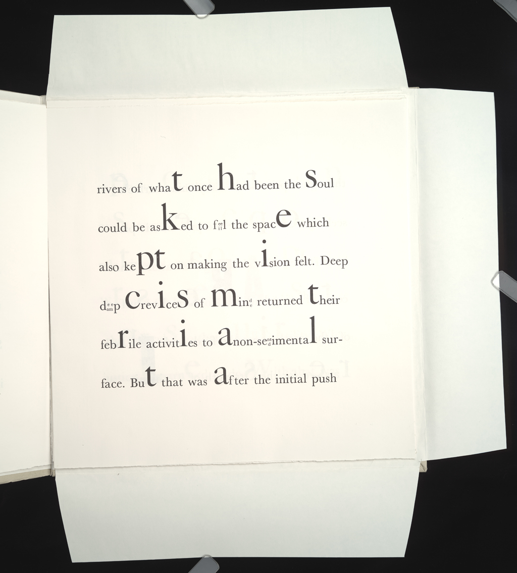
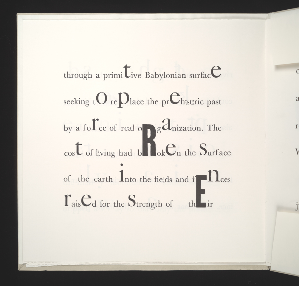
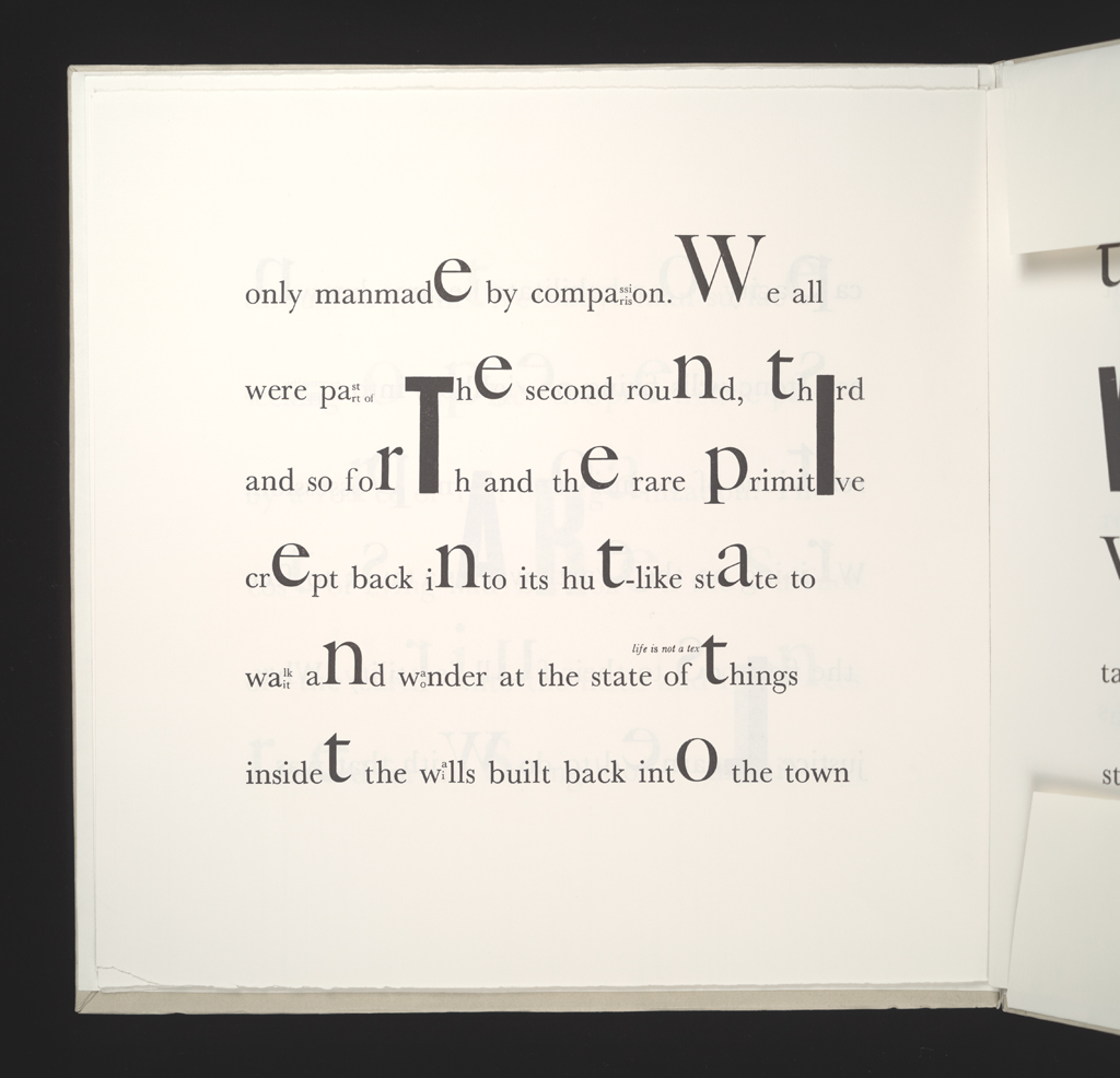
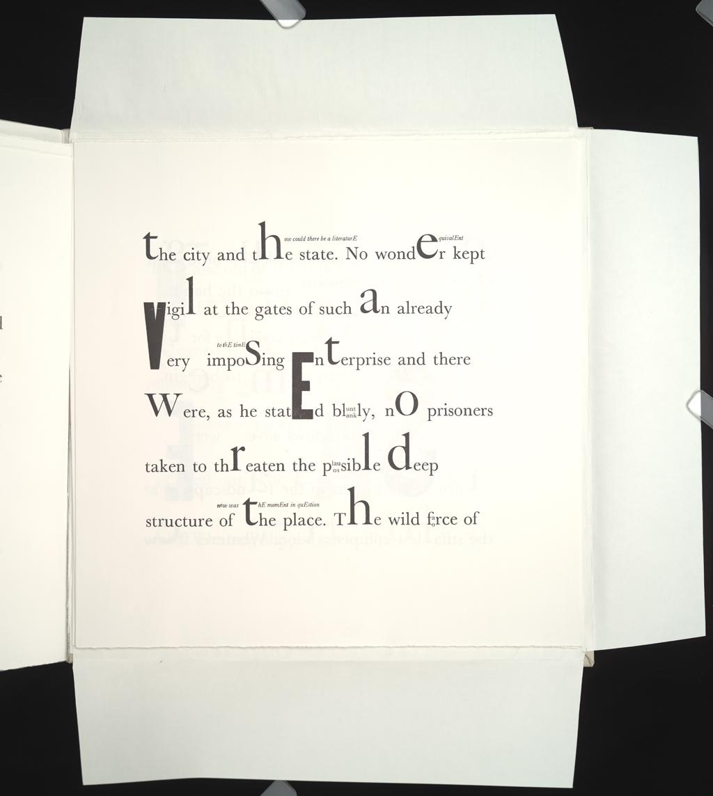
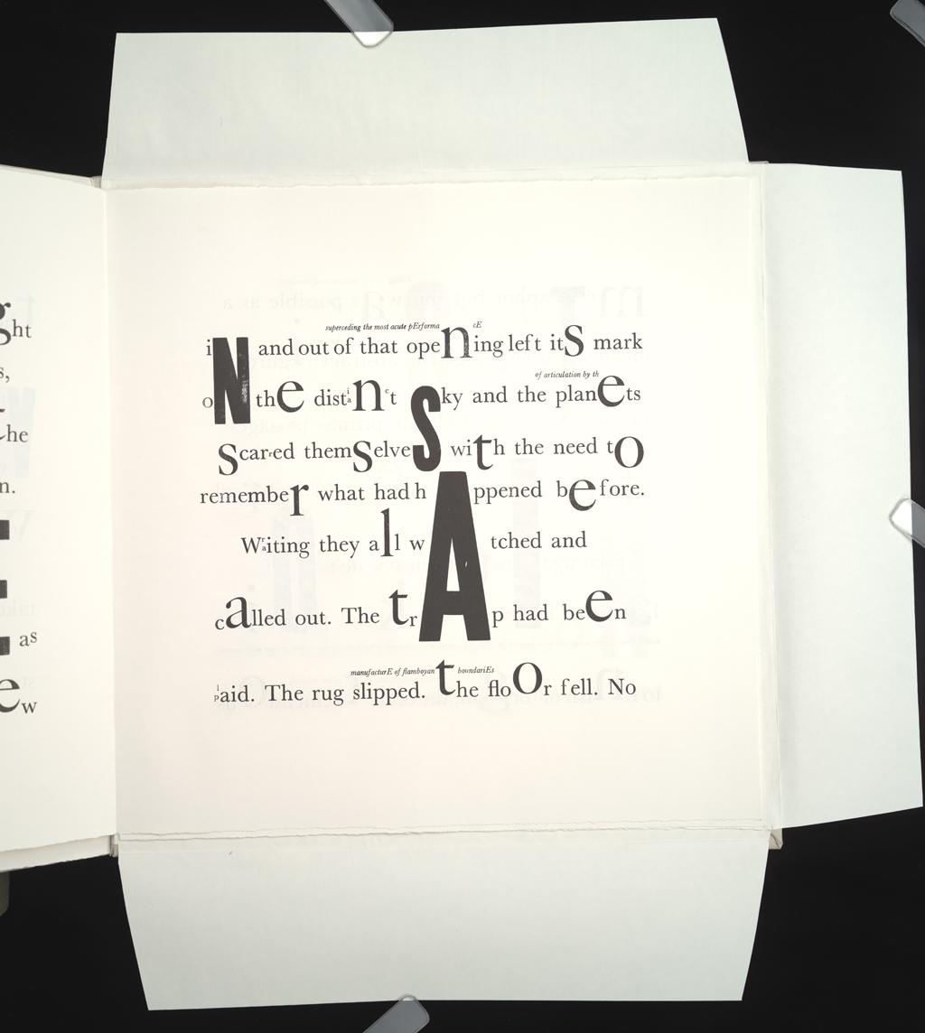
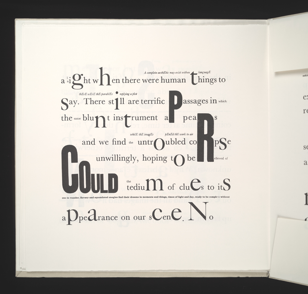
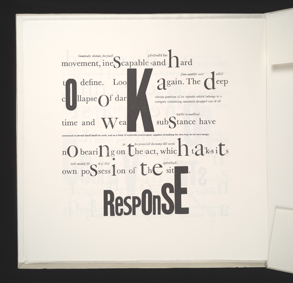
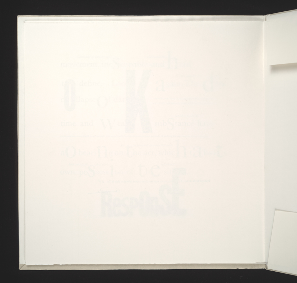
typographic: The typography begings with a fantastically clean, clear Caslon and proliferates into smaller and alrger type faces, including wood, italic fonts, and a range of letters that call out distinctive texts within the text.
graphical: The layouts are visually clean and striking.
development: Each typographic element introduced remains a working element as the text progresses.
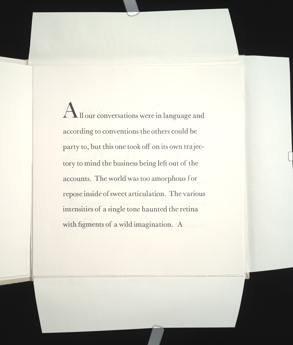
"All our conversations were in language, and according to conventions..." so it begins. The text is figured, evocative, suggestive, abstract, and self-referential.
The first page of the text shows only the Caslon type, and a single strain of language.
The final page of the text shows all of the many textual strands in play and graphically distinct, but interwoven.
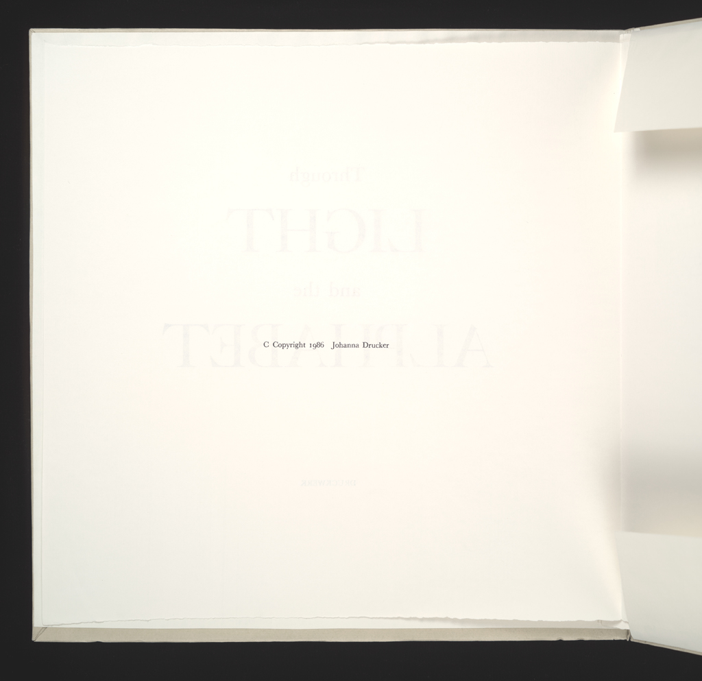
Johanna Drucker
type: initiating
role:
author
printer
designer
publisher: Druckwerk
dates:
publication: 1986-06-00
publication history: A single edition of this work was produced, this one.
subject:
artists' books (LCSH)
themes: The pleasure of language as matter and metalanguage, as metaphysical and material, as stuff and substance, image and form.
content form:
experimental text (local)
publication tradition:
artists' book (local)
inspiration: This project is so sui generis that it would be impossible to trace it to any inspiration. Really.
manuscript type: texts
location: artist's archive
note: Some exist.
title note: An inexplicable title, metaphysical and suggestive, the things I love.
edition type: editioned
publisher: Druckwerk
place: Berkeley and Oakland
dates:
publication: 1986-06-00
edition size: 50 copies, 25 of which were offered for sale.
horizontal: 13" inches closed
vertical: 13" inches closed
depth: .15" inches closed
production means:
letterpress (local)
binding: other
substrate:
bookBlock: paper
endsheets: paper
media:
ink (local)
general description:
format: album (AAT)
cover:
color: yes
pagination: unpaginated
numbered?: unnumbered
signed?: signed
Printed at Berkeley, California, in an edition of 50 copies of which this is No[1-50] [signed].