


This book was inspired by research into the history of emblem books, rebuses, and other forms of visual and verbal text. The specific inspiration came from a book with the same title, a Dutch emblem book that used farm implements as the imagery for its moral lessons and contemplative verse. Though I never saw that book, or even reproductions from its pages, I was fascinated by emblem books at that time owing to my studies at University of California, Berkeley, towards a PhD focused on the history of writing, written forms, and visual manifestations of language. The idea of an emblem book that used implements, rather than icons or religious allegories, was inspiring. I thought that images of appliances, objects that had the capacity to be transformative in some direct, physical way, would work well in relation to a set of texts that were about prepositions, those most hinge-like, pivotal, elements of syntax. Thus the book, texts and images, is about transformative elements. The linoleum cuts were, as often is the case, a great pleasure to make. I had been drawing a lot of ordinary objects in the late 1970s and early 1980s, first as part of the postcard series I sent back to friends in Berkeley from my travels in Greece, Italy, and Holland, then in the warehouse as daily exercises.
This was not a hard book to make, the linoleum cuts, lino cut rule, and the strong bold gothic type were all well-suited to each other. All inked well and printed well, and sewing was straightforward. With this as with other books at the time, the greatest issue was cutting the paper.
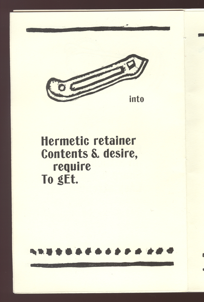
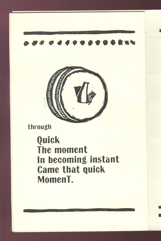
typographic: A very strong, bold gothic type, not sure precisely what face, meant to hold its own with the linoleum cut lines.
imagery: Linoleum blocks of appliances, or switches, or other ordinary objects capable of transformation, very bold, very simple, very strong.
graphical: Strong text, image, rule connections on the page.
openings: The formula repeats throughout of rule top and bottom, image, and texts.
A very minor work, but clear on its own terms and successful as a small demonstration of a specific idea.
Johanna Drucker
type: initiating
role:
artist
author
printer
publisher: self-published
dates:
publication: 1980-00-00
publication history: One edition only, and a small one at that. Very few copies remain in existence.
subject:
artists' books (LCSH)
themes: Transformation.
content form:
experimental text (local)
publication tradition:
artists' book (local)
inspiration: Emblem books, in particular, a Dutch work with the same title.
related works: This book is rather sui generis, though the lino cuts have something in common with the drawings in Italy.
community: school U.C. Berkeley, vaguely, and the poets as always.
manuscript type: mockups
location: other
note: I don't think any manuscripts, texts, or mockups remain.
title note: The title is taken from a Dutch emblem book (16th century?) of the same name.
edition type: editioned
publisher: self-published
dates:
publication: 1980-00-00
edition size: 48
horizontal: 5 inches closed
vertical: 8 inches closed
depth: .1 inches closed
production means:
letterpress (local)
linoleum (local)
binding: hand sewn (local)
substrate:
bookBlock: paper
endsheets: paper
media:
ink (local)
format: codex (AAT)
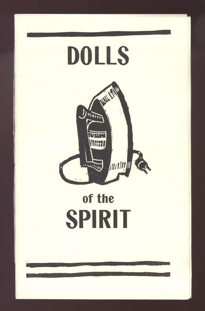
cover: The cover is printed on the same ivory paper as the rest of the book. The front cover contains a linoleum cut print of an iron with the title. The back cover contains a linoleum cut print of a thumbtack above the artist's name, copyright date, and copy number.
color: no
pagination: unpaginated 12 pages
numbered?: numbered
signed?: unsigned
none
manuscript type: mockups
location: other
note: I don't think any manuscripts, texts, or mockups remain.