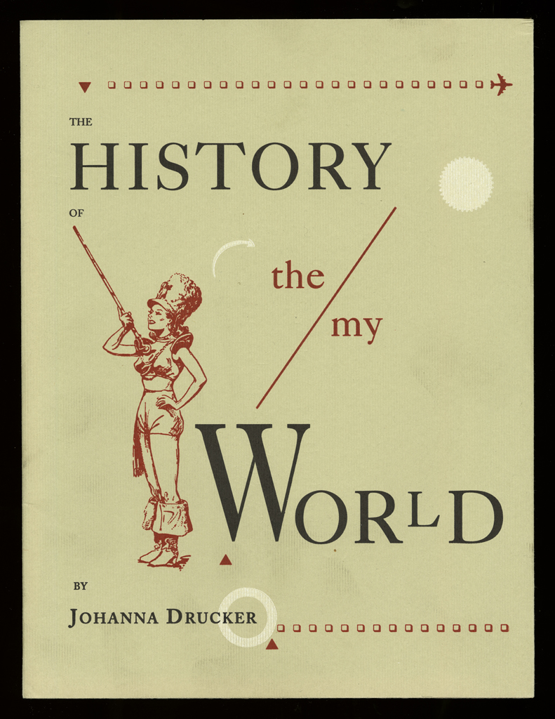
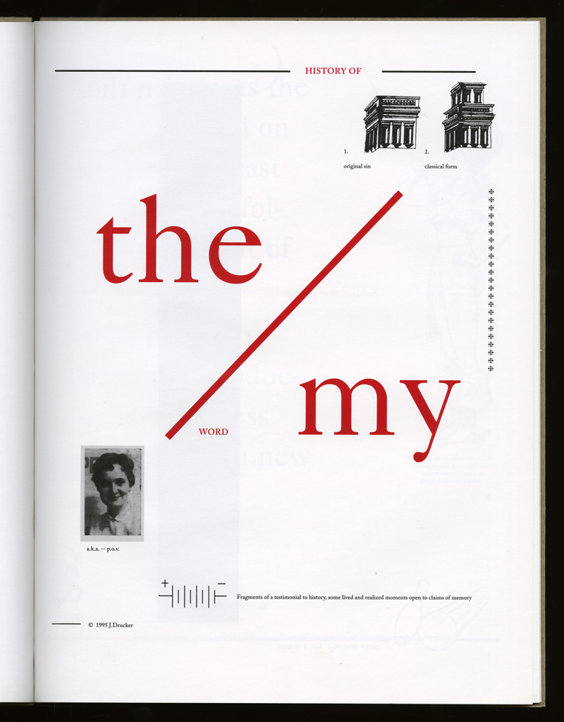
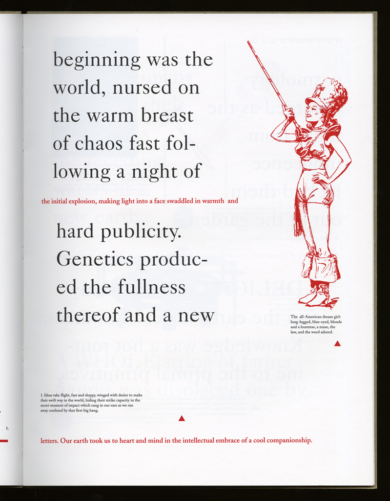
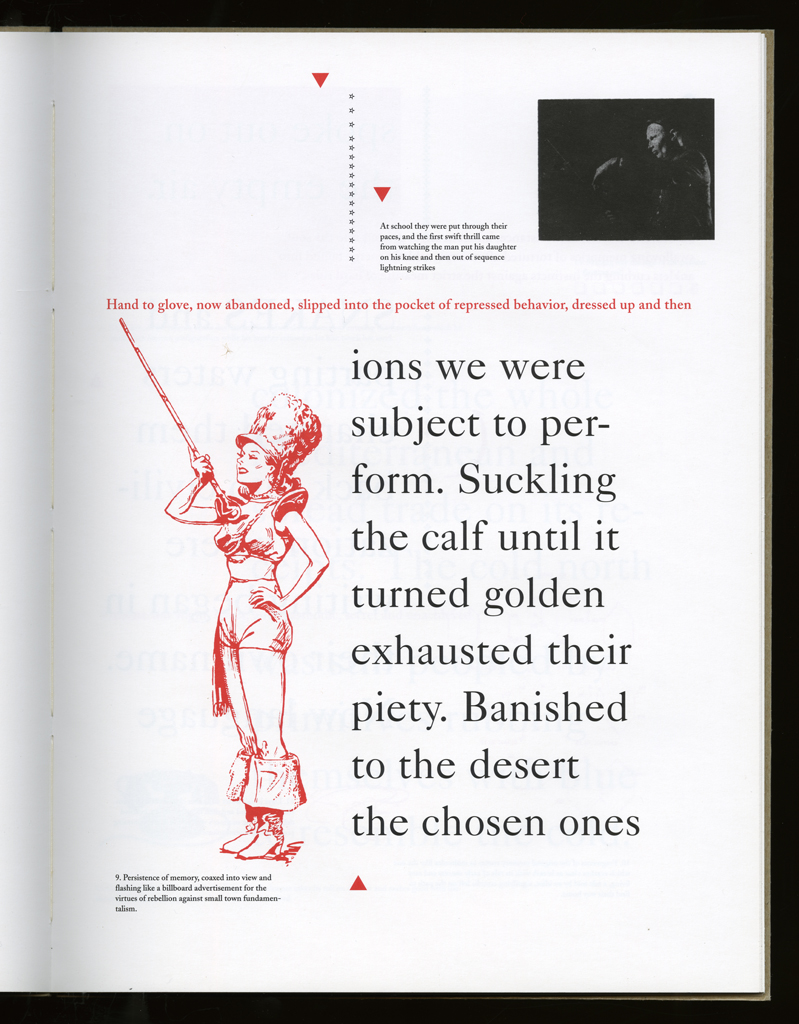
Several themes interweave in this book: a feminist rewriting of the history of the world, an opposition between official history and personal memory, a critique of feminist theoretical attitudes towards language as patriarchal, and all sorts of graphical and textual puns and play. The book is a tribute to my mother, and the drum majorette who opens the book is a figure that corresponds to her early years, youth, and activities as a baton twirling teen in Downer's Grove, Illinois. I had learned language, and literature, through an intense and intimate relation with her. The feminist dogma of language as patriarchal didn't fit the erotic and personal experience of my relation to the literary through the relation to her, even male identified as she was. She may have been the law, and the symbolic, but she was fiercely feminine and feminist as well. So the red text erupts through the black, making memory a strain of presence within the history retold.
The second edition is a facsimile of the first, except for the covers, which were printed letterpress by me from polymer plates on my Vandercook. Brad Freeman did the photographic separations in the darkroom and produced the offset facsimile at Soho Services in New York City.
typographic: The type is used to distinguish history from memory, the received and reworked from the personal lines.
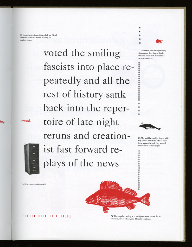
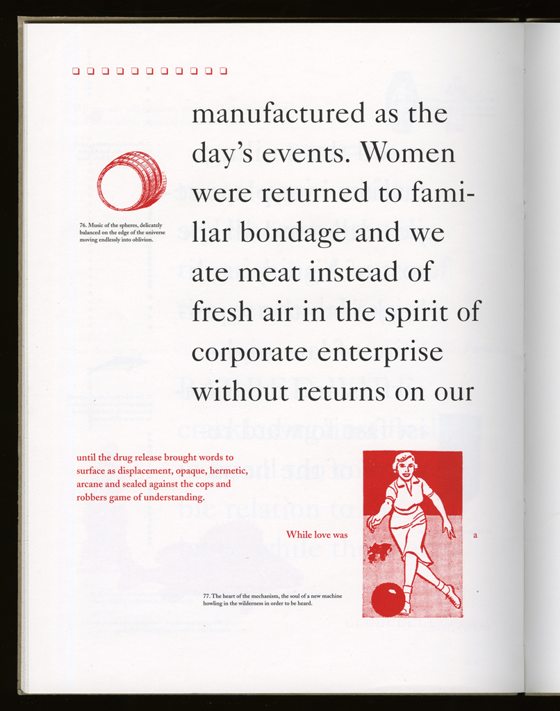
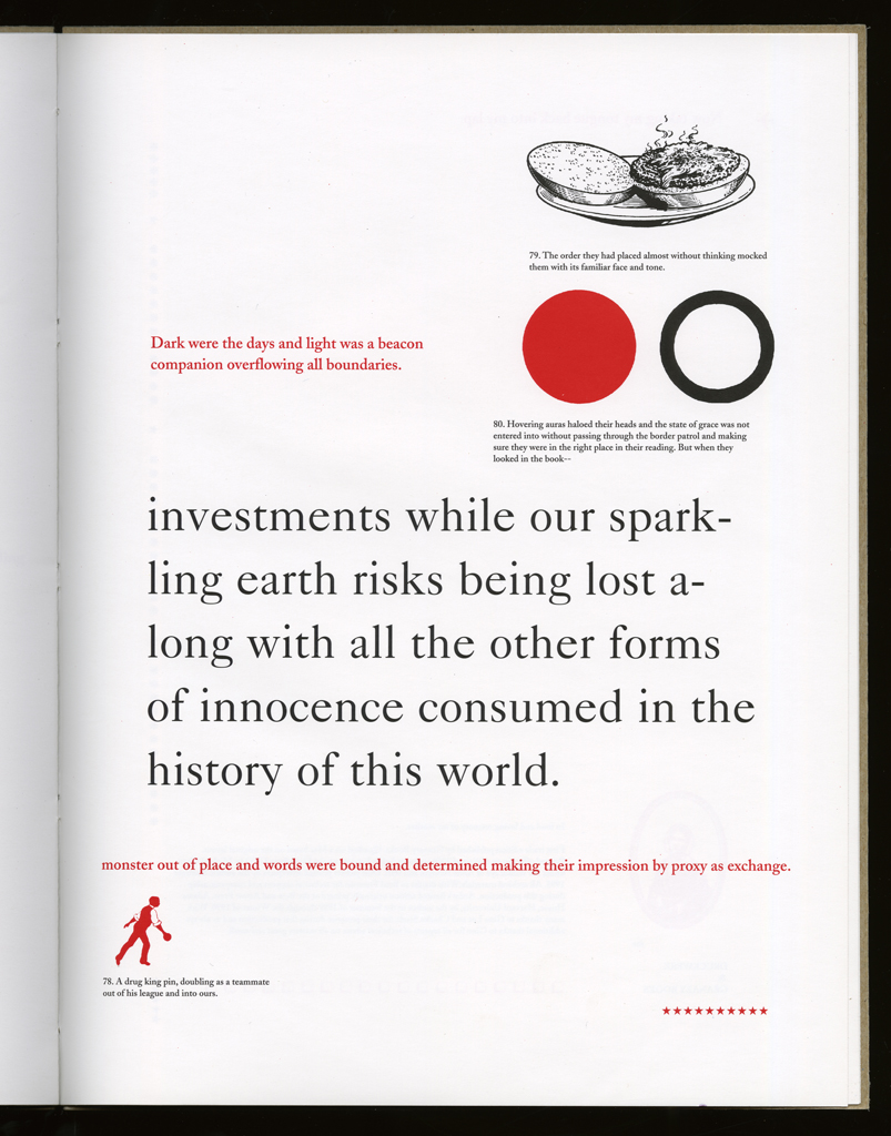
imagery: All found cuts, line and half-tone, all letterpress.
graphical: Borders, dingbats, and other devices help punctuate the page and introduce a sign set as part of the text.
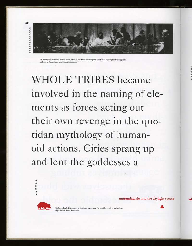
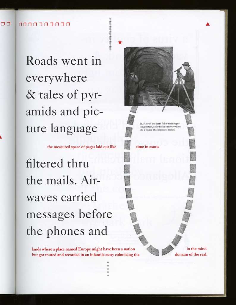
openings: The only page that uses an image across the gutter is a full spread, and it has the photographic cut of the Last Summer tableau.
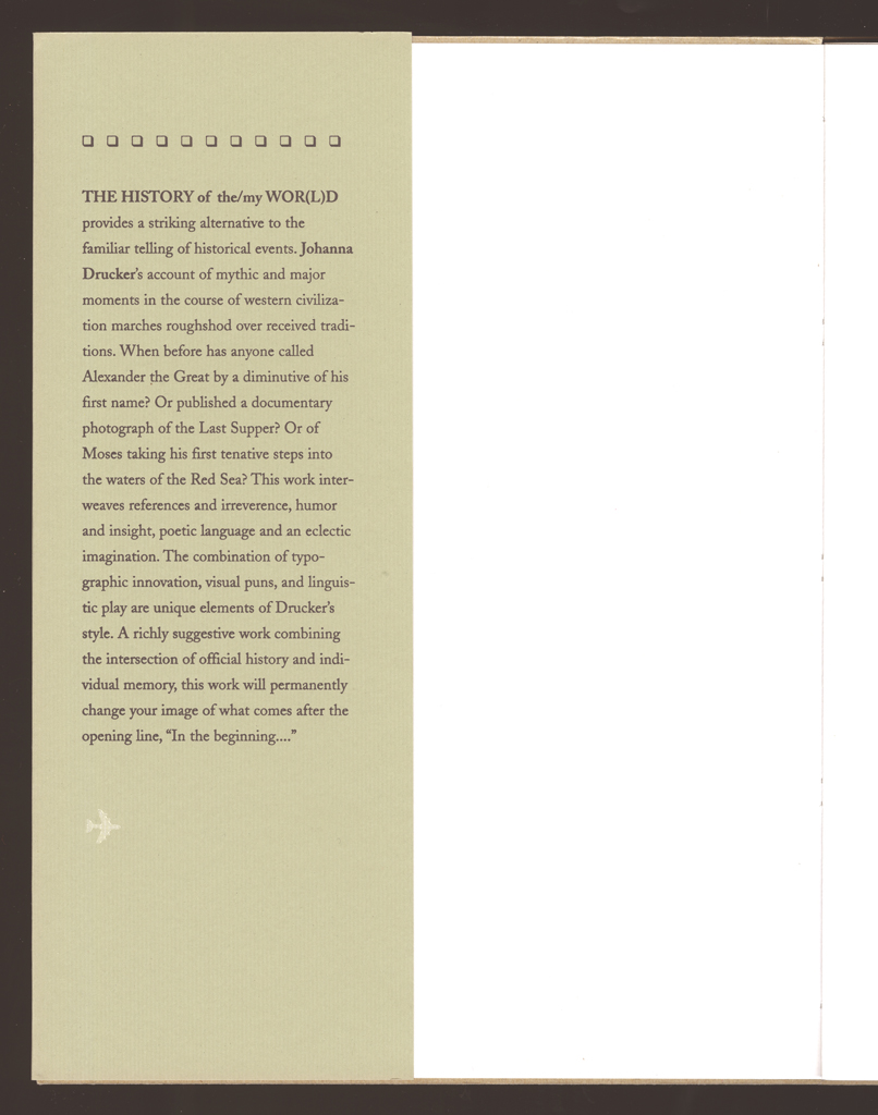
First and second editions are very close, but the cover is distinctive in each case. The second edition cover has more in common with the interior. The first edition cover looked very Russian Constructivist, and not really quite in the tone of the interior, some folks thought. The paper choice for the second edition cover was somewhat problematic, as the green ribbed surface was not ideal for printing, but it has worked to a nicely faced brown, much better than the original color, which was too green. All other issues are as per the first edition.
Johanna Drucker
type: initiating
role:
author
printer
designer
publisher: Druckwerk
dates:
publication: 1990-06-00
publisher: Granary
dates:
publication: 1995-09-00
publication history: Two editions of this work were produced.
subject:
artists' books (LCSH)
content form:
experimental text (local)
publication tradition:
artists' book (local)
inspiration: Tom Phillips's work inspired me, not A Humument, but some of the works that dealt with sequence as a constraint.
manuscript type: texts
location: artist's archive
note: All in existence.
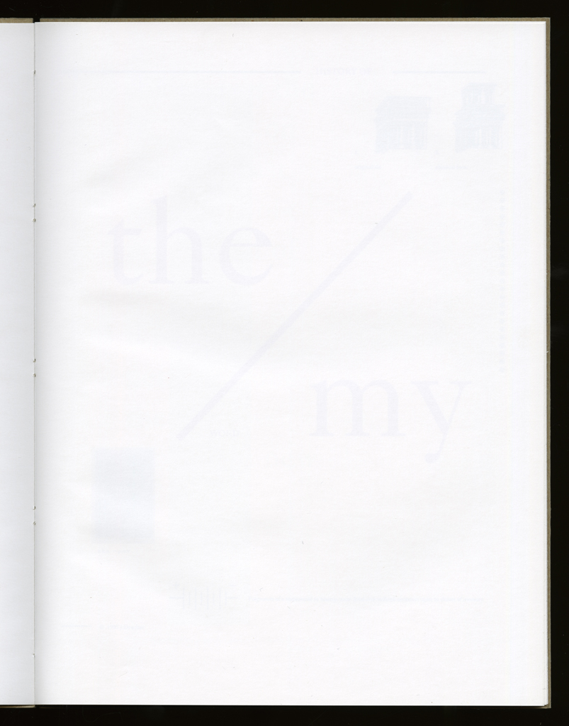
title note: The many themes of the book are encoded in the title, and the Word/World and the/my oppositions announce the language/knowledge and history/memory oppositions that are crucial to its textual and conceptual dynamics.
Johanna Drucker
type: initiating
role:
author
printer
designer
Steve Clay Granary Books
type: initiating
role:
publisher
dates:
publication: 1995-09-01
edition type: editioned
publisher: Granary
place: Soho Services, New York
dates:
publication: 1995-09-00
edition size: 2000 is what the colophon says, but I think this is impossible. I think it was 300 or 500. Can't have been much more, since I did all the covers on my press and they took five runs each. I remember it was a long run, but that doesn't seem possible.
horizontal: 8.5" inches closed
vertical: 11" inches closed
depth: .25" inches closed
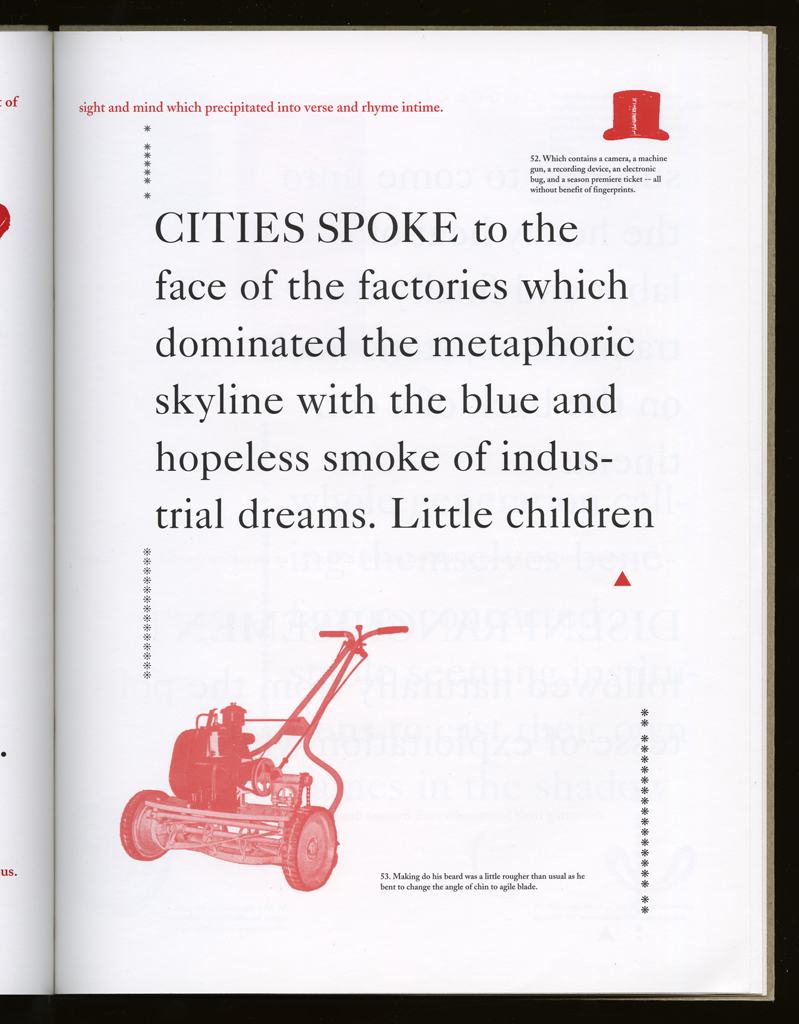
production means:
offset (local)
binding: smyth sewing (AAT)
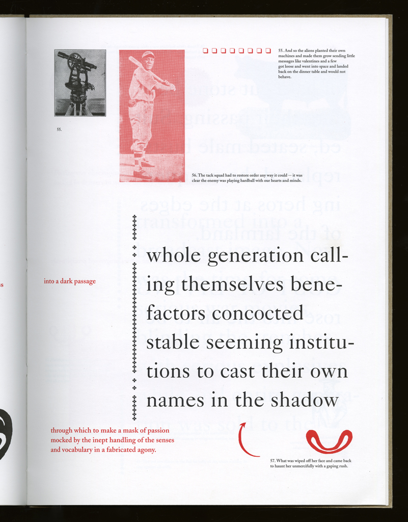
substrate:
bookBlock: paper Warren's Lustro
Dull
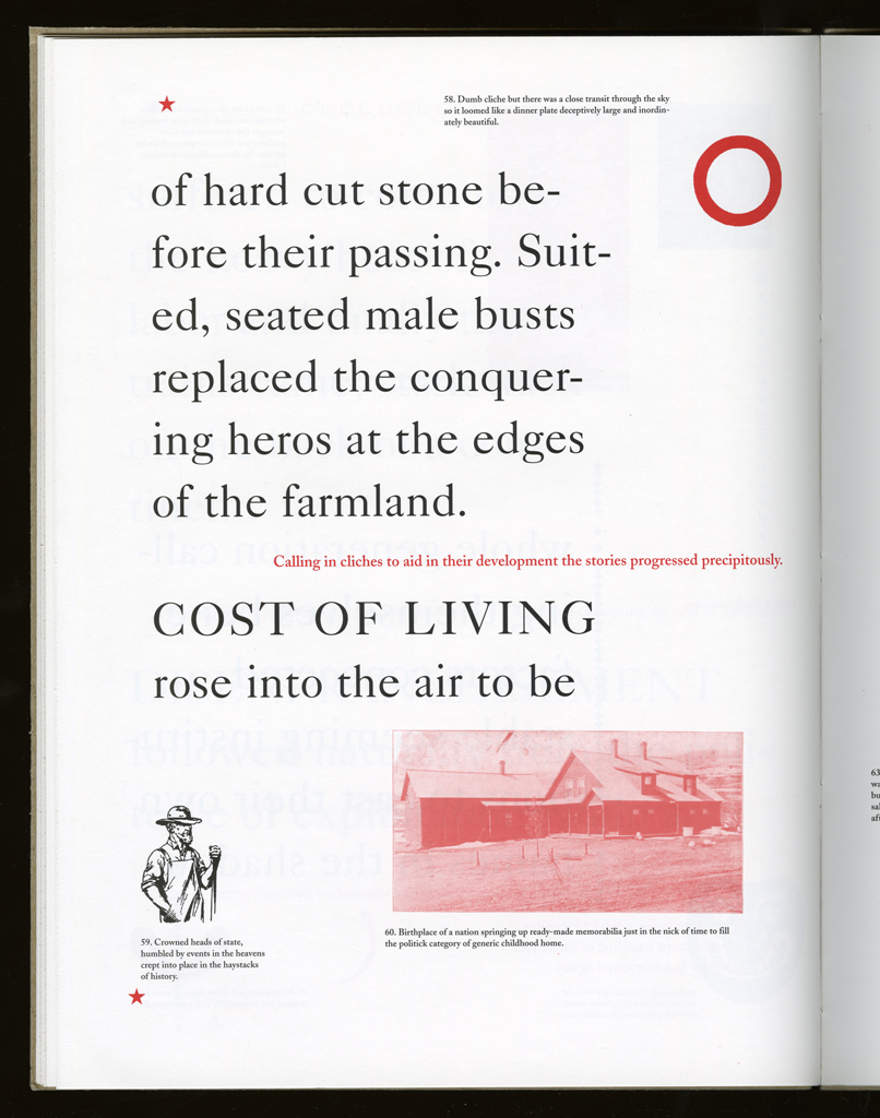
endsheets: paper
media:
ink (local)
format: codex (AAT)
cover: Dust jackets, letterpress printed in black, white, and red.
color: yes
pagination: unpaginated
numbered?: unnumbered
signed?: unsigned
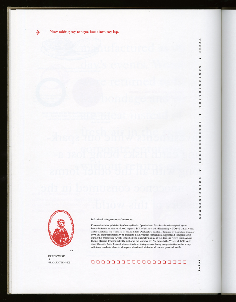
In fond and loving memory of my mother. / First trade edition published by Granary Books. Quarked on a Mac based on the original layout. Printed offset in an edition of 2000 copies at SoHo Services on the Heidelberg GTO by Michael Chan under the skillful eye of Anne Noonan and staff. Dust jackets printed letterpress by the author. Summer 1995. All archival materials. With thanks to Brad Freeman for technical support and companionship during this production. Artists' limited edition originally printed at the Bow and Arrow Press, Adams House, Harvard University, by the author in the Summer of 1989 through the Winter of 1990. With many thanks to Gino Lee and Charles Steele for their presence during that production and as always additional thanks to Gino for all aspects of technical advice on all matters great and small.